Scope
Naming, Identity System, Environmental Graphics, Brand Story
Industries
Real Estate, Architecture, Urban Development, Multifamily
Year
2015
Milwaukee was ready for a reset. The skyline was shifting, the creative class was returning, and developers saw opportunity in the city’s understated charm. In the middle of it all stood an unloved, 1970s-era office tower that had sat empty for years. Our challenge was to turn that black wedge into Milwaukee’s first Class A residential building: one that felt modern, proud, and unmistakably local.
The Challenge
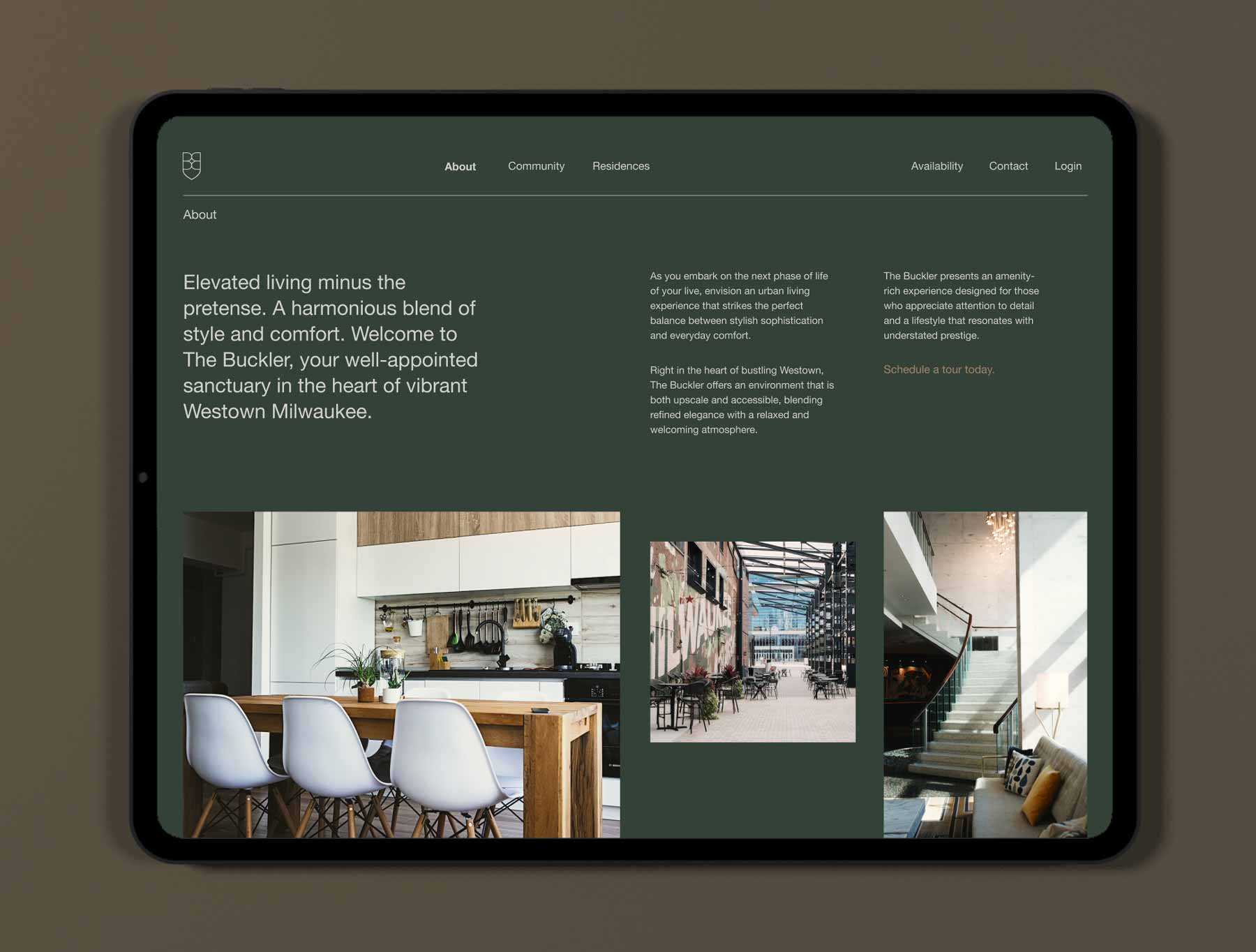
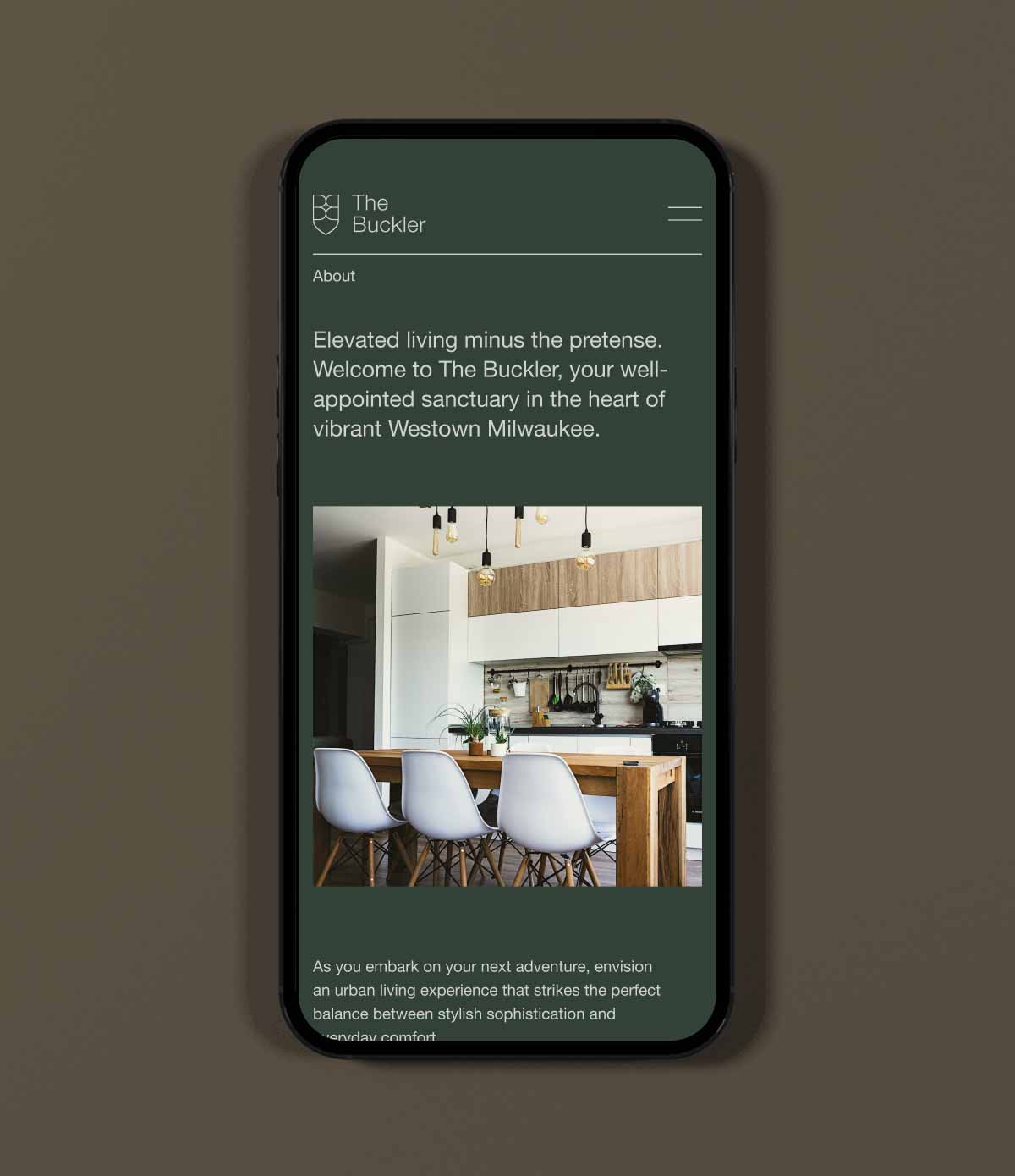
Made for Milwaukee. Ready for More.
Milwaukee isn’t a city that embraces flash. Luxury here needs context. And this building, 401 W. Michigan Avenue, didn’t exactly come with curb appeal or a storied past. It was an 11-story black wedge that had sat empty for years. The city’s buzz was building, but this project needed more than marketing polish. It needed a brand that made people care.
The team needed to signal quality without alienating locals. The identity had to elevate the offer, but feel like it belonged to the neighborhood and not something dropped in from the coasts. We needed a name and a design system that could stand out in a crowded rental market while still respecting Milwaukee’s character.

The Name
Milwaukee isn’t a city that embraces flash. Luxury here needs context. And this building, 401 W. Michigan Avenue, didn’t exactly come with curb appeal or a storied past. It was an 11-story black wedge that had sat empty for years. The city’s buzz was building, but this project needed more than marketing polish. It needed a brand that made people care.
Then it clicked. “The Buckler.” The name was simple, strong, and carried weight.
- A nod to the Milwaukee Bucks arena, just blocks away.
- A subtle callback to the building’s original tenant, Blue Cross Blue Shield of Wisconsin.
- A word that suggests craftsmanship and protection; luxury that feels earned.


The Mark
Milwaukee isn’t a city that embraces flash. Luxury here needs context. And this building, 401 W. Michigan Avenue, didn’t exactly come with curb appeal or a storied past. It was an 11-story black wedge that had sat empty for years. The city’s buzz was building, but this project needed more than marketing polish. It needed a brand that made people care.
Then it clicked. “The Buckler.” The name was simple, strong, and carried weight.
- A nod to the Milwaukee Bucks arena, just blocks away.
- A subtle callback to the building’s original tenant, Blue Cross Blue Shield of Wisconsin.
- A word that suggests craftsmanship and protection; luxury that feels earned.

The Visual Style
A Modern Classic
Rather than shout for attention, the design exuded quiet confidence. Every element reflected Milwaukee’s grounded personality: natural greens, weathered browns, and soft grays that felt organic to the city and in tune with the building’s eco-friendly updates.
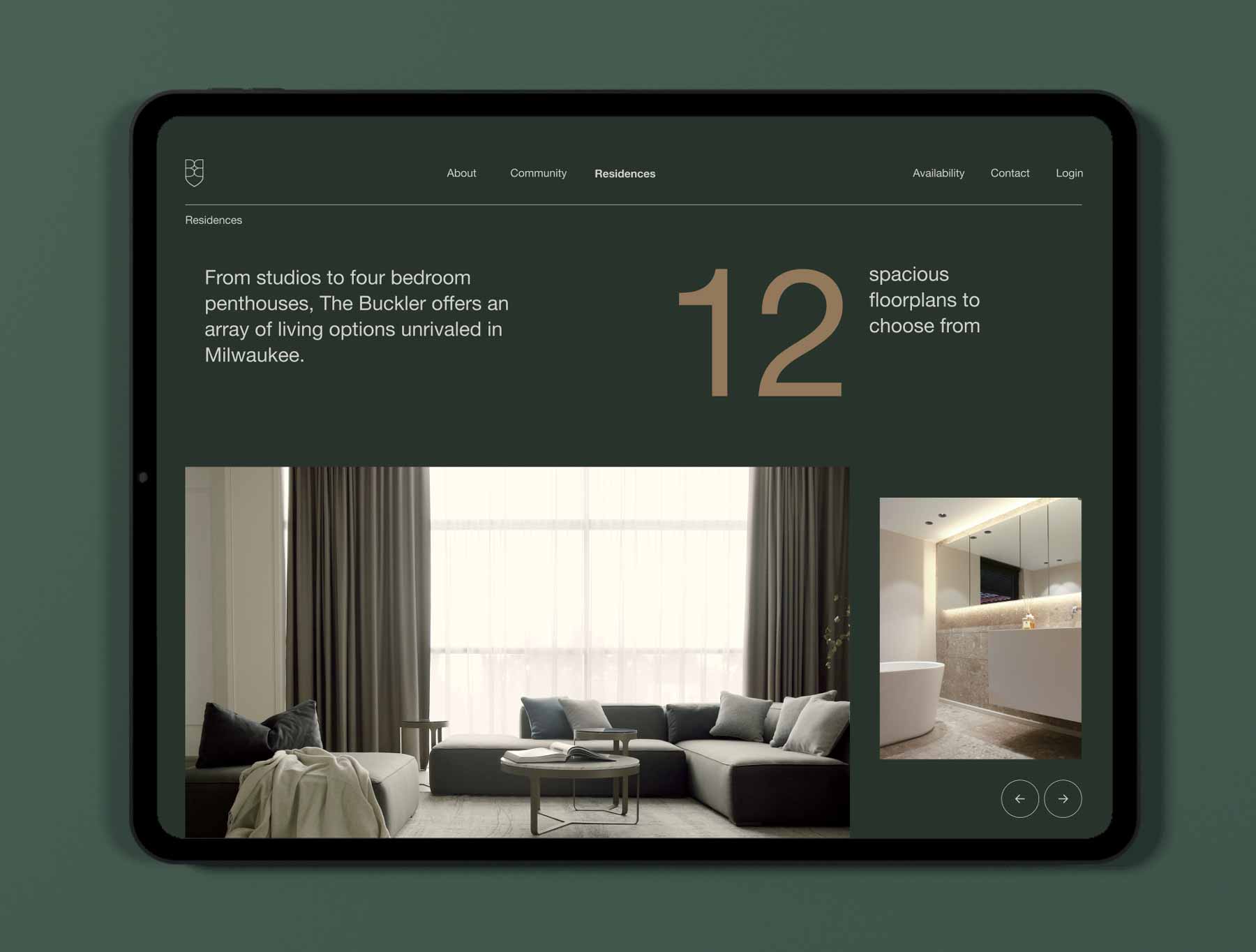
The palette wasn’t chosen to follow a trend but to reflect a shift toward authenticity, sustainability, and a more understated kind of luxury. Typography was minimal and architectural, allowing the materials to lead: wood, stone, and metal that age gracefully and feel lived in from the start.
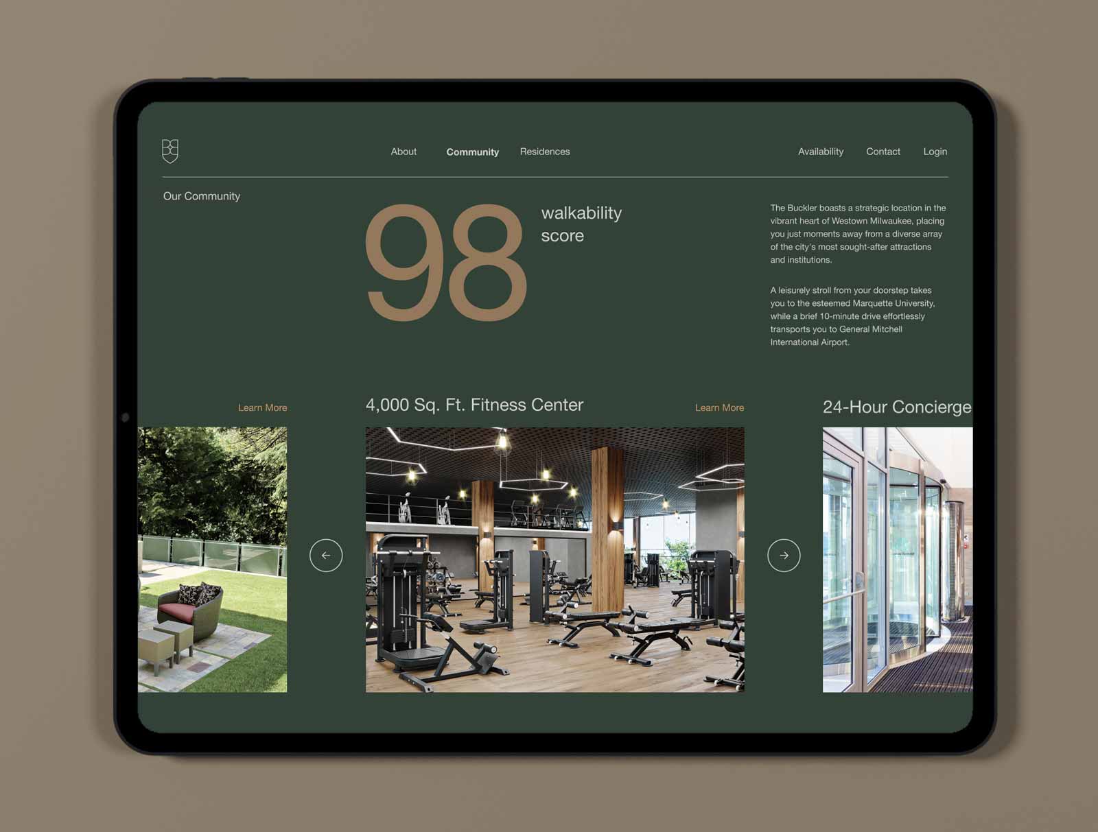
Working alongside the interior and landscape teams, we carried that sensibility into every detail. Wayfinding and signage blended into the environment, designed to feel inevitable rather than imposed. The result was a brand and space perfectly aligned: modern, tactile, and quietly self-assured.
The Results
The Buckler’s launch exceeded expectations. Full occupancy hit months ahead of forecast. Local coverage celebrated its design-forward approach, and the name quickly became part of the neighborhood’s vocabulary.
What began as an unloved office block became a symbol of Milwaukee’s creative resurgence — proof that even a building without history can create one.
Takeaways
The Buckler proved that when architecture, design, and story align, even an unloved building can become a city landmark. This project transformed a 1970s office tower into a modern residential icon that felt distinctly Milwaukee: proud, grounded, and built to belong.
Developing a unique identity system for a real estate project
A name sets the foundation for place and purpose. “The Buckler” struck the right tone: confident but approachable, nodding to Milwaukee’s craft heritage and community pride. The clean, interlocking double-B crest carried that balance through the brand system: a modern structure with a sense of historical legacy.
A name sets the foundation for place and purpose. “The Buckler” struck the right tone: confident but approachable, nodding to Milwaukee’s craft heritage and community pride. The clean, interlocking double-B crest carried that balance through the brand system: a modern structure with a sense of historical legacy.
Defining the role of environmental graphics in branding.
Design details turned the identity into an experience. Wayfinding, signage, and material choices tied the visual language directly to the architecture, creating an environment that felt natural, not staged. The result was a brand people lived within, not just ogled at.
Design details turned the identity into an experience. Wayfinding, signage, and material choices tied the visual language directly to the architecture, creating an environment that felt natural, not staged. The result was a brand people lived within, not just ogled at.
Creating a memorable brand story for a new development.
Belonging beat luxury. Every touchpoint reinforced a sense of place, from the name’s local resonance to the palette’s organic tones and sustainable textures. The story honored Milwaukee’s humility and craftsmanship, proving that authentic storytelling builds trust faster than any tagline.
Belonging beat luxury. Every touchpoint reinforced a sense of place, from the name’s local resonance to the palette’s organic tones and sustainable textures. The story honored Milwaukee’s humility and craftsmanship, proving that authentic storytelling builds trust faster than any tagline.