Scope
Brand Strategy, UI/UX & Web Design, Content Architecture
Role
Strategy, Design, Copy
Year
2015
When Pappageorge Haymes Partners turned thirty, they weren’t looking back, they were leveling up. Known for adaptive reuse, context-driven modernism, and community-first design, their work spoke volumes, but their website didn’t. The brand felt dated, the messaging lacked weight, and the digital experience didn’t match their architectural confidence. Our task was to build a digital identity (strategy, UX, and story) that felt as intentional and human as the spaces they create.
Metrics
40%
Growth, Average Session Duration
18%
Growth, Organic Website Traffic
33%
Growth, Online Project Inquiries
The Problem
Great Work, Quiet Story
PH Partners had the kind of portfolio that wins awards and earns trust: high-rise towers, restored landmarks, and neighborhood-scale work that actually responds to people. Big projects in major cities. But none of that came through online. The site looked old. The copy sounded generic. And whatever “voice” existed was scattered across proposals, RFPs, and one-off presentations.
We ran stakeholder interviews, audited competitors (large and boutique architecture firms), and combed through decades of project write-ups. The pattern was obvious: while other firms were loudly pushing community impact and sustainability, PH Partners let those values live only in the buildings. We needed to pull them into the language.
The Shift
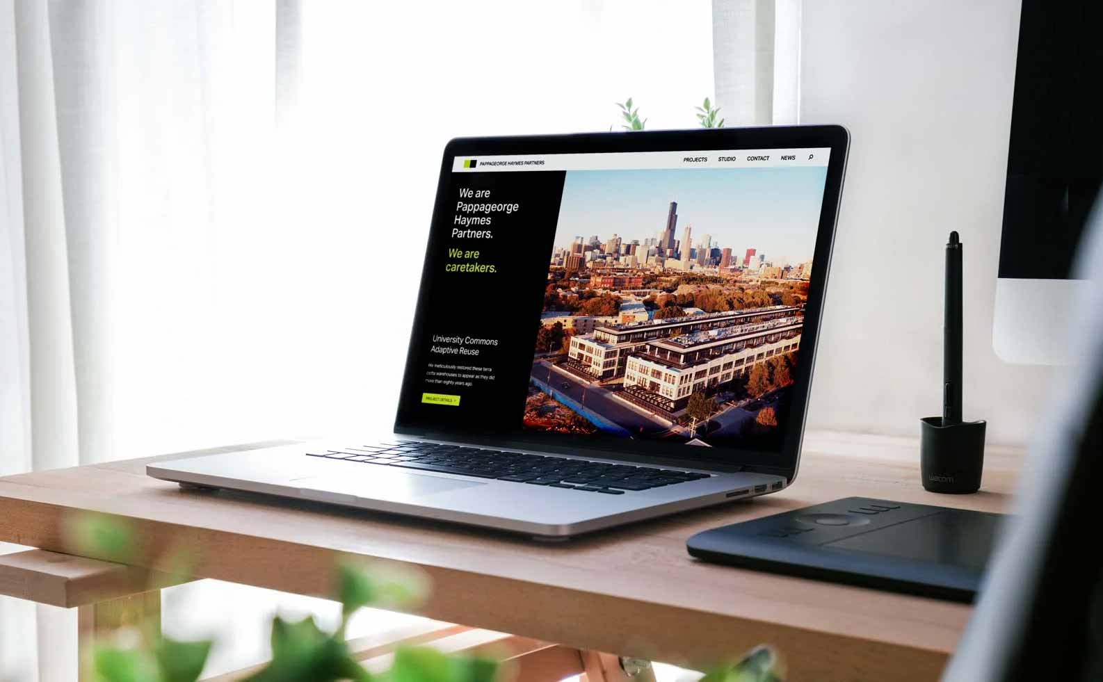
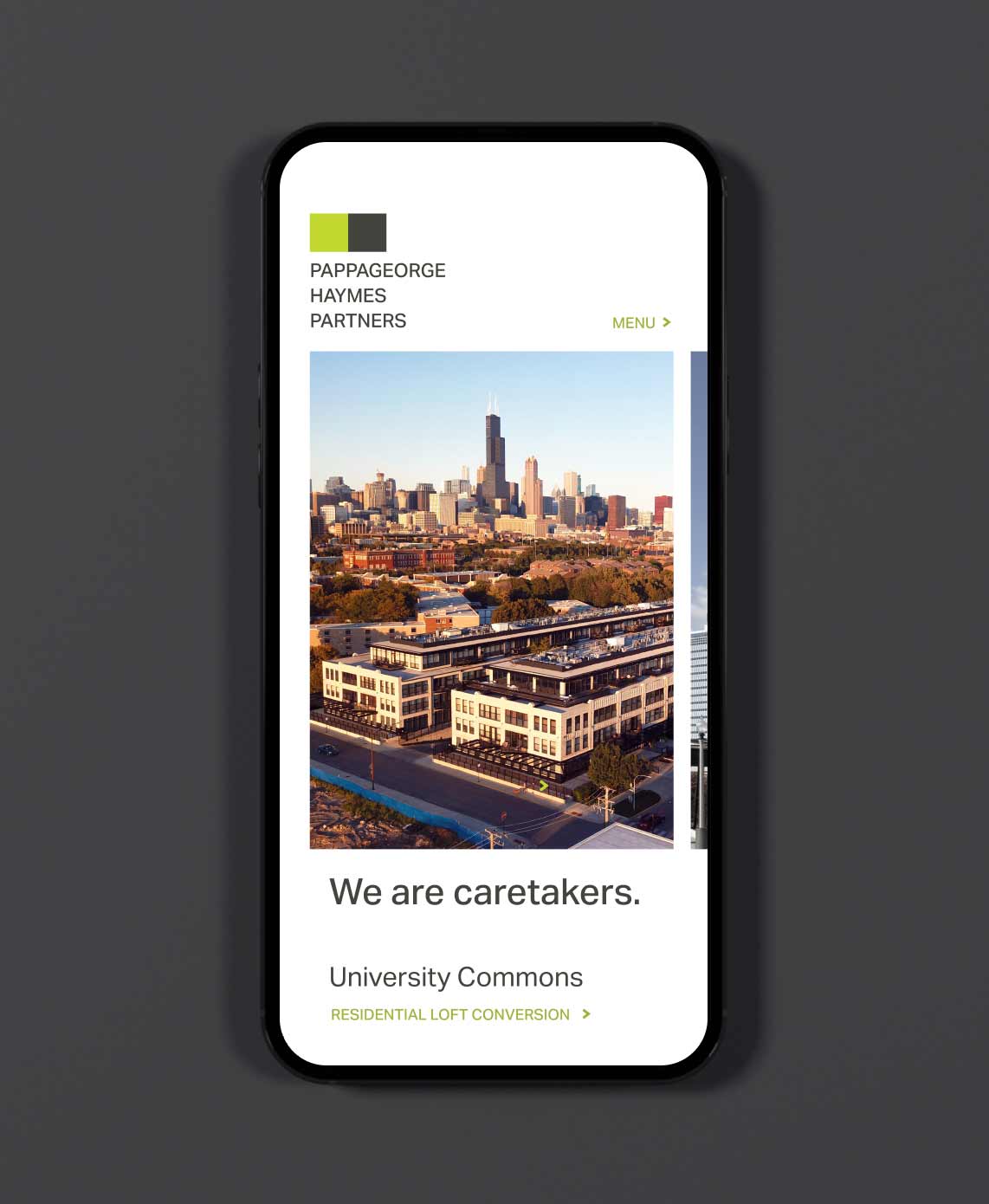
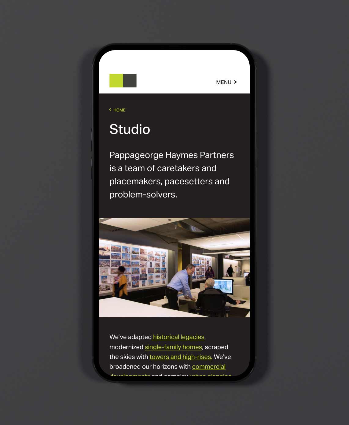
Caretakers. Placemakers. Collaborators.
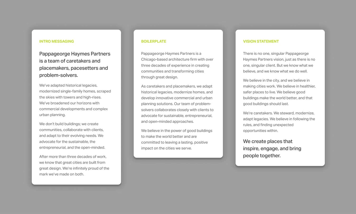
Rather than chasing trends, we rooted the brand in the roles PH Partners already played. We framed the firm not just as architects, but as collaborators and advocates, people who shape spaces that reflect real community needs. These roles became messaging anchors that could evolve with the firm over time, giving internal teams a flexible system for everything from decks to social posts.
We took language directly from the work. Words like stewardship, legacy, openness, and scale became cornerstones of the voice. The brand didn’t need reinvention. It needed clarity. It needed tone and structure that felt as thoughtful as the buildings themselves.
The Approach
A Thoughtful Digital Blueprint
Instead of buzzwords, we focused on the roles the firm already played across its portfolio: Caretakers (of legacy buildings), Placemakers (for communities), Collaborators (with clients, city officials, and residents). Those roles became the spine of the brand messaging system—usable in new business proposals, social posts, and internal onboarding.
We pulled language from the work itself: stewardship, legacy, openness, scale. No abstract mission statements, just noble attributes the team was proud to stand behind.
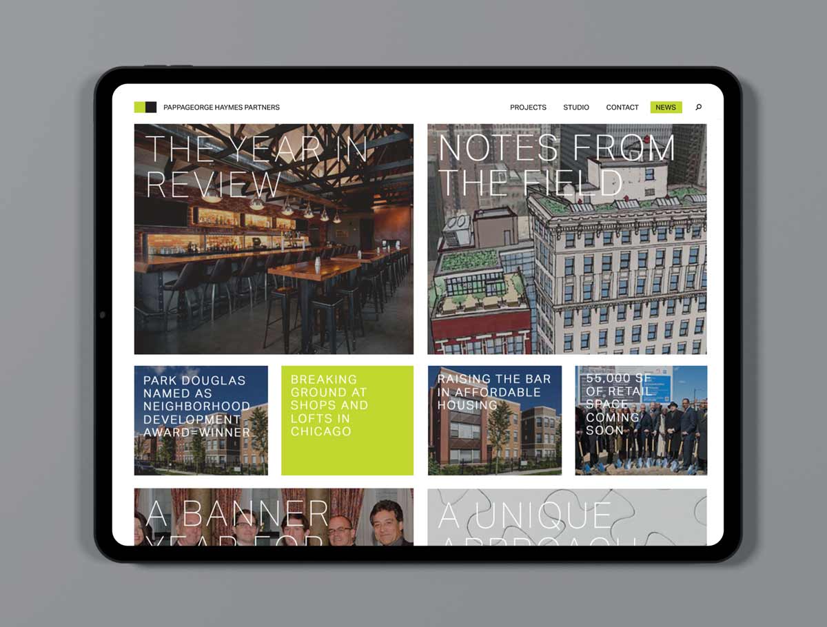
We approached the site design the same way PH Partners approaches a building: define purpose, sketch structure, iterate.
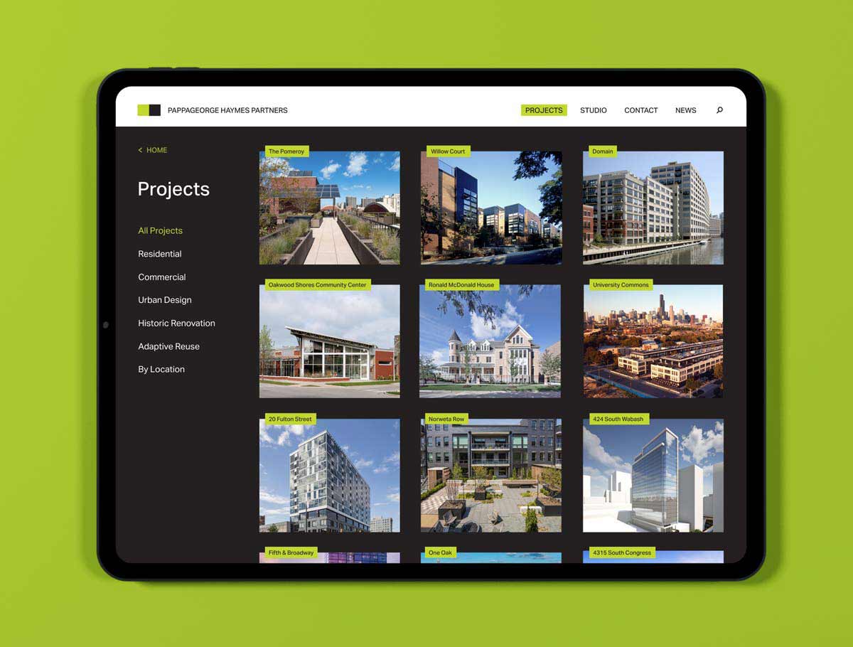
- Content Audit & IA: Mapped every project type, service, and audience pathway.
- Wireframes & Prototypes: Tested how imagery, narrative, and data should flow on desktop and mobile.
- Design System: A tight grid, generous white space, and typography that lets imagery and copy breathe.
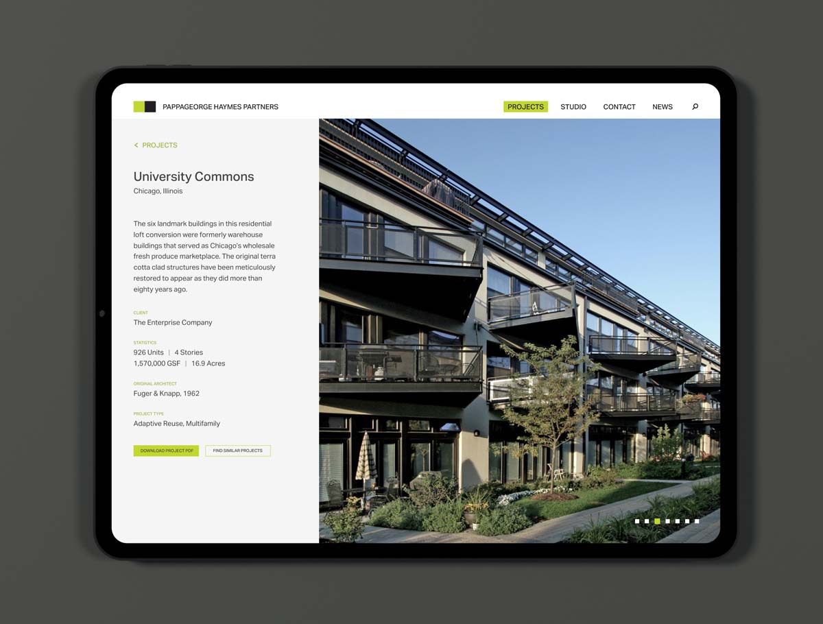
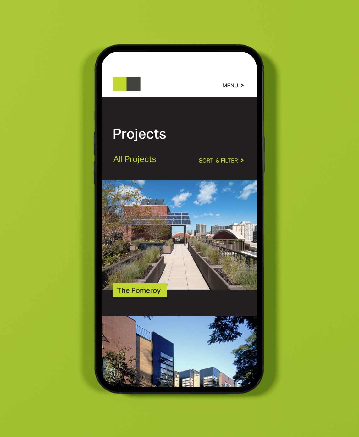
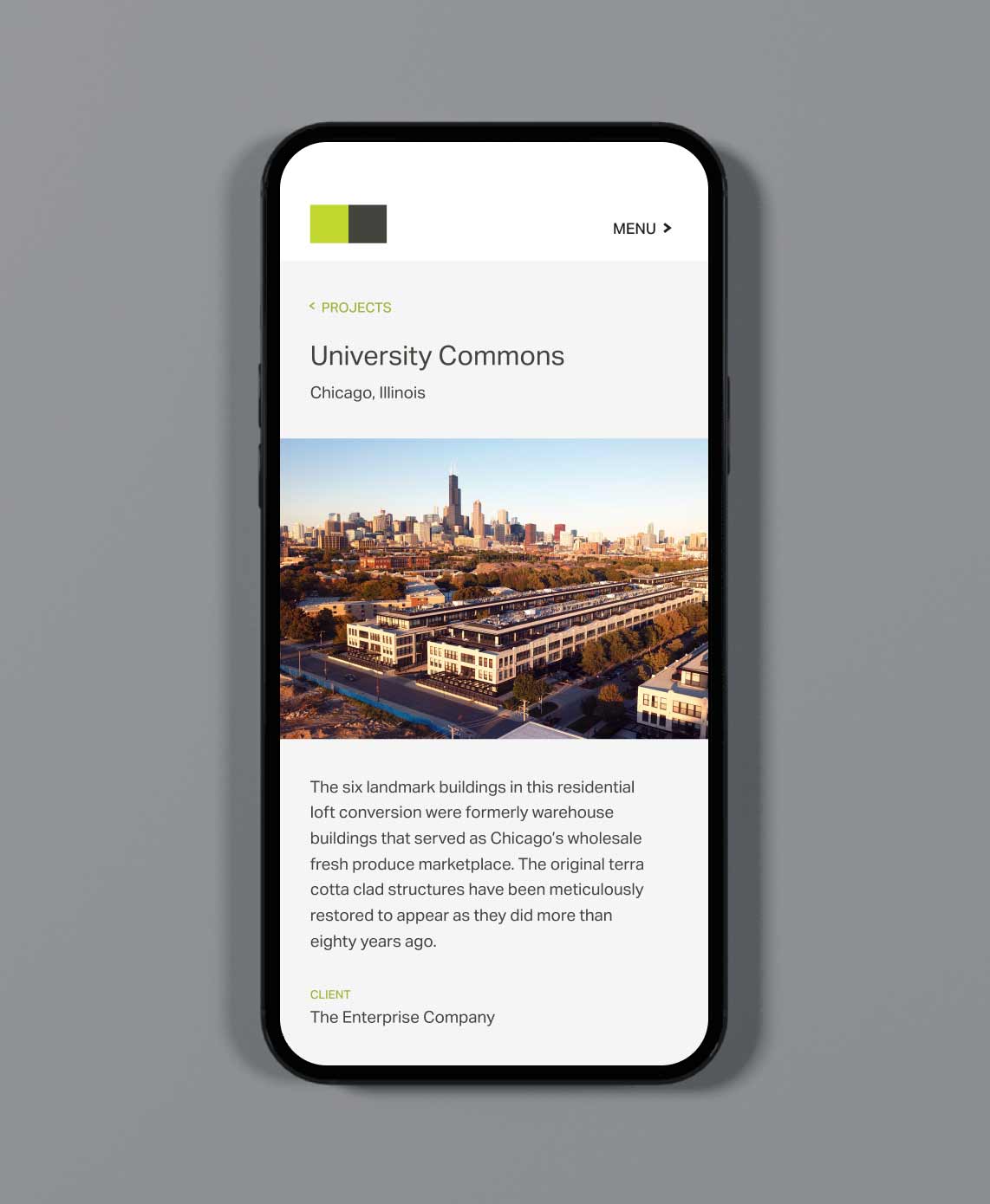
- Project Galleries: Quiet, image-first, and easy to scan with UX patterns geared toward developers, city agencies, and prospective hires.
- Modular Messaging: The roles (Caretakers, Placemakers, Advocates) sit at the center, so new focus areas can slot in without rewriting everything.
Results
40%
Growth, Average Session Duration
18%
Growth, Overall Site Traffic
33%
Growth, Online Project Inquiries
The new identity didn’t just look good, it delivered. Sales decks now feel sharp and on-message. Campaigns drive action. Messaging lands with clarity and consistency across every touchpoint. What used to be a list of specs is now a story of reliability, accessibility, and confidence.
More importantly, the team finally has tools that are easy to update, easy to use, and built to grow. AmpUp now shows up in the market the same way its chargers perform: ready when people need them, and built to keep moving forward.
Takeaways
Building for the Future
Instead of buzzwords, we focused on the roles the firm already played across its portfolio: Caretakers (of legacy buildings), Placemakers (for communities), Collaborators (with clients, city officials, and residents). Those roles became the spine of the brand messaging system: usable in new business proposals, social posts, and internal onboarding.
We pulled language from the work itself: stewardship, legacy, openness, scale. No abstract mission statements, just noble attributes the team was proud to stand behind.
We approached the site design the same way PH Partners approaches a building: define purpose, sketch structure, iterate.
- Content Audit & IA: Mapped every project type, service, and audience pathway.
- Wireframes & Prototypes: Tested how imagery, narrative, and data should flow on desktop and mobile.
- Design System: A tight grid, generous white space, and typography that lets imagery and copy breathe.
- Project Galleries: Quiet, image-first, and easy to scan with UX patterns geared toward developers, city agencies, and prospective hires.
- Modular Messaging: The roles (Caretakers, Placemakers, Advocates) sit at the center, so new focus areas can slot in without rewriting everything.