AmpUp Helping businesses go electric and never look back.

Scope
Brand Identity & Messaging, Naming, UI/UX,  Web Design, Omnichannel Campaigns
Industries
Clean Tech, EV Charging, SaaS, Energy
Year
2025
We helped AmpUp evolve from a tech platform into a purpose-driven brand shaping the next generation of electric mobility.
Beyond redesigning the site, we built the messaging, named the products, and redefined how they communicate reliability, access, and sustainability across channels. The result is a scalable brand system built to accelerate progress in clean transportation.
Metrics
18%
Growth, Organic
Traffic
41%
Growth,
Time on Site
22%
Growth, Pages
per Session

The Challenge

Confidence, Not Kilowatts

The shift to electric isn’t just about cars, it’s about infrastructure, logistics, and uptime. Drivers want chargers that work every time. Property managers want systems they can set and forget. Fleet operators want visibility and control without ballooning costs. But industry-wide uptime hovered below 75%. If gas pumps failed one out of four times, there’d be outrage. In EV, it’s just “normal.”
We audited more than 20 competitors and found nearly all led with hardware features. Only a handful mentioned reliability or access. AmpUp had the proof (industry-leading uptime, smart load management, and inclusive deployment models) but no narrative to hold it together.
Our task was to turn technical excellence into human confidence, and make “access for all” the brand’s true differentiator.

The strategy map defines the creative path from user needs and pain points to a brand built on trust, clarity, and proof. It shows how we translated day-to-day friction into focused positioning, design patterns, and brand voice that speaks directly to the users. Strategy isn’t just a starting point, it keeps the work honest at every step.

The  Idea

Driving Electric Mobility Forward, One Charge at a Time

AmpUp’s strategy ditched technical selling for something more human. The goal was to make EV charging straightforward, reliable, and built for every kind of driver, not just the green-at-all-costs crowd. With real-world availability and zero guesswork, AmpUp sees a future where electric vehicles aren’t the exception but the default.
AmpUp’s mission became the narrative engine: make EV charging easy, accessible, and future‑proof for all. From there, the rallying cry practically wrote itself. “We Get EV Power to Your People” is more than a headline; it’s a marching order for every employee and a promise to every customer. It reframes charging from a technical chore into a mantra.

An effective tagline does more than just sound good, it connects expertise and value directly to the audience.

We Get

Expertise & support, not just transactions

Implies a process
and partnership

EV Power

Way beyond hardware: software, service, & scale

Alludes to the freedom to roam / from range anxiety

to Your People

Speaks directly to business customers, clarifis B2B

Includes drivers, operators, decisions makers, and partners

Tagline Adaptations

EV Power to Your People isn’t just a tagline, it’s a flexible message you can adapt to any audience. Swap in “your people" for “your clients” or “your community” to speak directly to the groups that matter most, keeping the core promise while making it personal.

The voice followed suit: optimistic, confident, and inviting. Values like reliability and adaptability moved out of slide decks and into campaigns, case studies, and onboarding flows. Every proof point served a single goal: give drivers and operators the confidence they need to embrace electric mobility.
Alongside the brand narrative, we named AmpUp’s product suite to create a clear, intuitive system. Each name reinforces the company’s mission to make electric mobility easier to manage, measure, and trust.
  • EV Cloud: Centralized  platform that connects every charger, site, and user.
  • Fleet Depot: Operations dashboard built for fleet managers who need control at scale.
  • Field Console: Mobile-first tool for installers to manage chargers in real time.

The AmpUp logo and core colors (green + purple) were already set when we came in. Our job was to make them work harder. We embraced the boldness, built out a deeper set of supporting colors, and introduced rich gradients and high-contrast type treatments. Paired with dramatic photography and direct, benefit-driven copy, the new look feels more confident, more complete, and way easier to use.

The Approach

Designed for Trust, Built for Growth

The visual language is designed to flow like electricity itself and to reflect AmpUp’s core strengths: reliability, clarity, and ease of use. Vivid color sweeps and soft gradient pulses guide attention across the marketing site, one‑pagers, and campaigns, echoing the promise that power is always within reach. 
The anchor green signals “ready” across every touchpoint. Supporting tones add depth without leaning into tired eco-design. Motion accents are minimal but purposeful. Headlines glow on scroll, key stats light up briefly, and dividers create a smooth sense of flow, reinforcing a brand that moves with intention.
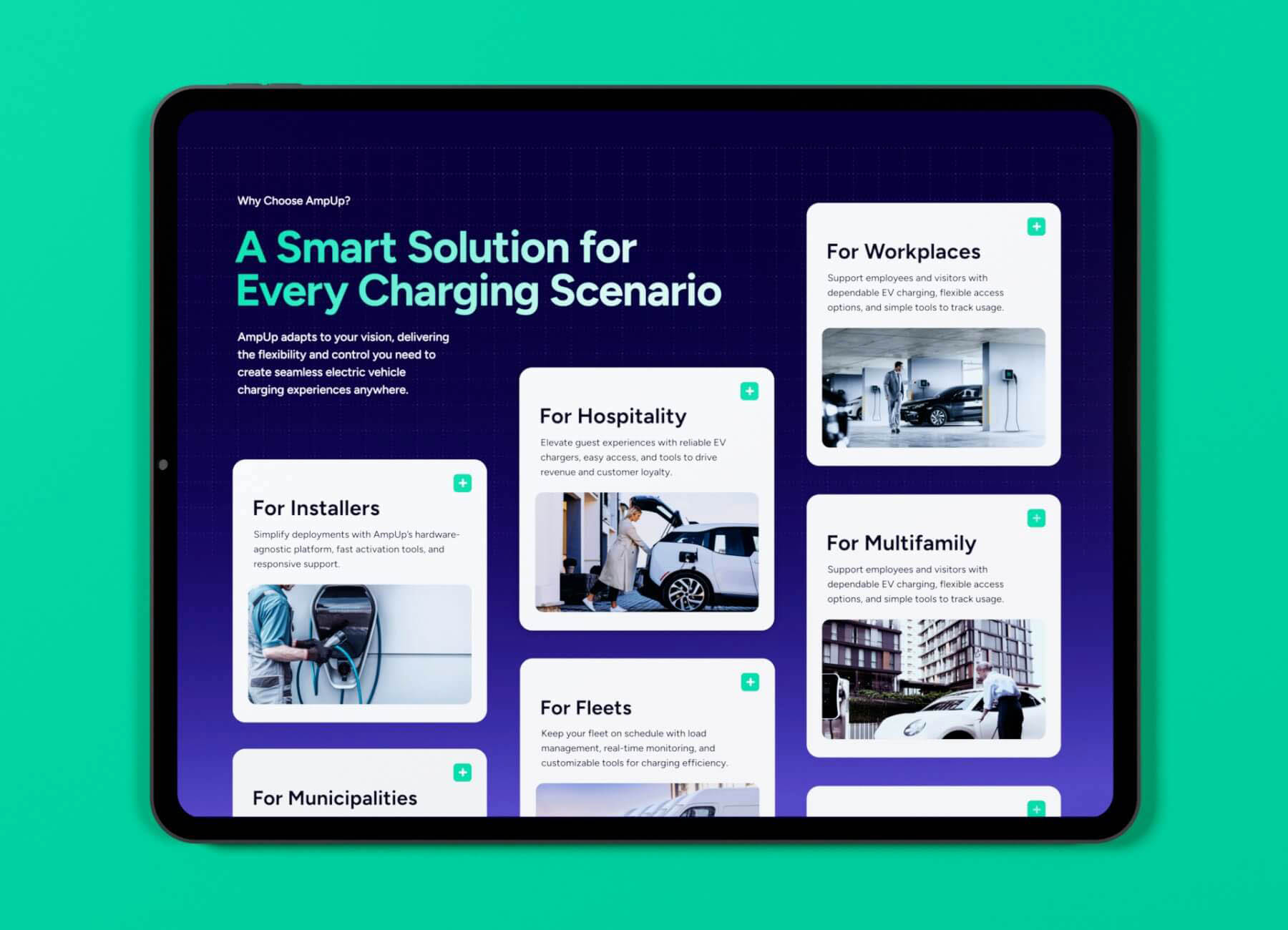
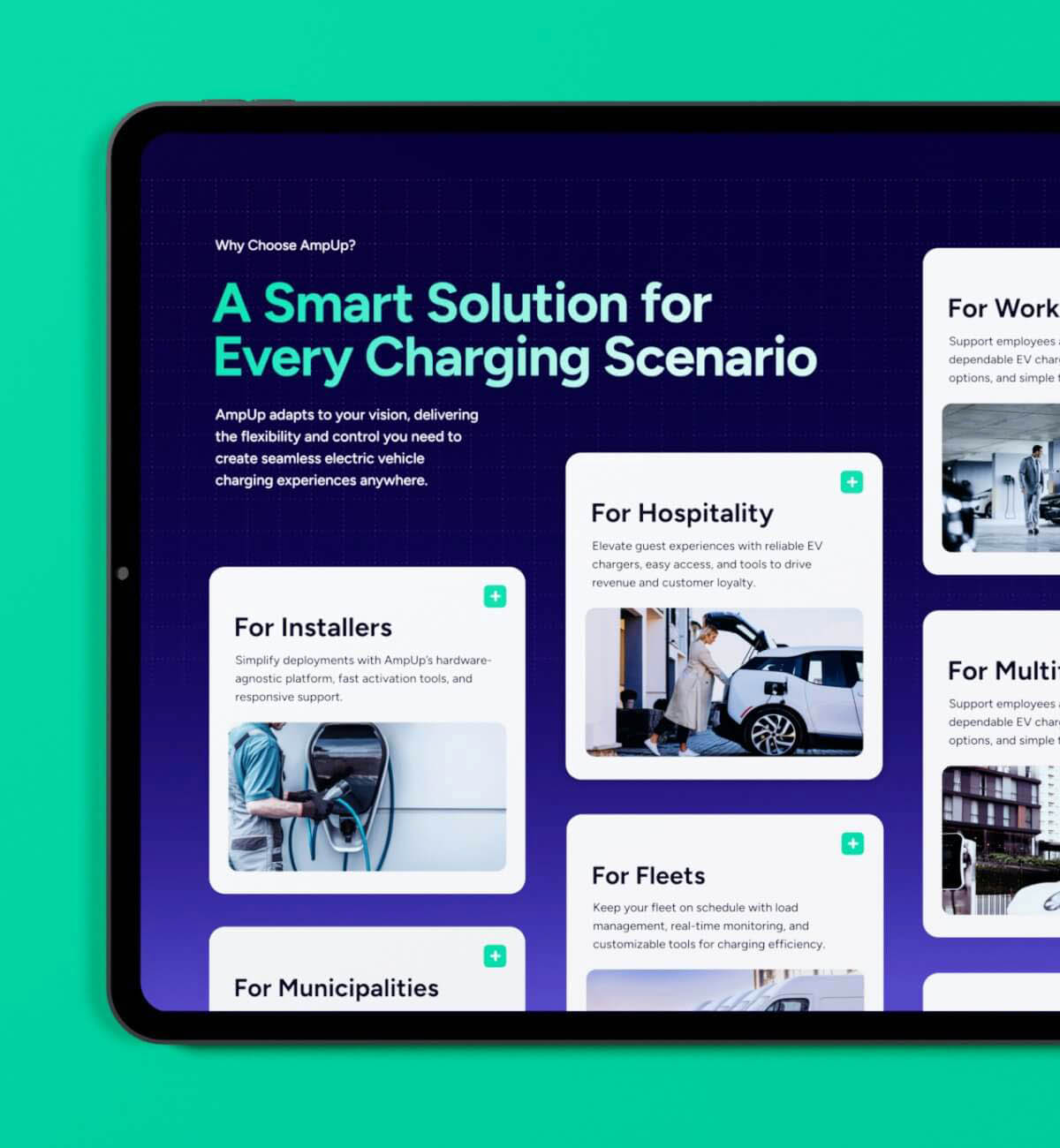
Every page leads with proof. The homepage features live uptime and session data, followed by user journeys grounded in real scenarios: drivers, property managers, city teams. High-contrast imagery keeps things human and real, showing the product in action without over-staging it.
Behind the scenes, a modular Webflow setup gives the team full control. New case studies, partner logos, or rebate banners can be launched on the fly. The design doesn’t just look smart, it's ready to (quickly) scale with the sector and stays ahead of change.

Each use case page pulls double duty as an educational hub and a keyword engine. Designed to grow by intent clusters (fleets, workplaces, cities, hospitality, etc.) the architecture lets AmpUp capture demand where it happens while maintaining a consistent narrative and user experience.
Results

18%
Growth, Organic
Web Traffic
41%
Growth, Average
Time on Site
22%
Growth, Pages
per Session
Good brands feel inevitable in hindsight because they align with how users already think. After launch, AmpUp’s story clicked: prospects spent longer, explored deeper, and raised hands more often. The numbers are not fireworks; they are dependable growth, which is exactly the story we set out to tell.
Just as importantly, the internal team finally has a unified language for telling their story. Product, marketing, and sales now pull from the same playbook, making every customer interaction part of one connected brand experience. AmpUp now shows up in the market the same way its chargers perform: ready when people need them, and built to keep moving forward.

AmpUp’s values (dependability, access, and adaptability) come to life in real features: uptime guarantees, live diagnostics, and monitoring that never sleeps. Trust isn’t claimed; it’s demonstrated.

Takeaways

Working with AmpUp revealed what it takes to grow a SaaS brand inside a fast-changing clean-tech market. The lessons are simple but powerful: build a content system that adapts as the company evolves, protect SEO integrity by focusing on intent rather than trends, and write a story that is clear enough to work in any channel.
How to develop a cohesive brand identity for a tech startup.
A brand identity starts with people, not pixels. We helped AmpUp define a mission that connects human outcomes to measurable value: reliable uptime, accessible infrastructure, and visible sustainability. From that foundation, we built a brand messaging framework that links strategy, design, and voice so every touchpoint (website, sales deck, product naming, or campaign) tells the same story in its own way. Read more about developing an effective brand voice.
What are effective omnichannel campaign strategies for B2B.
Consistency is the real performance metric. We built connected campaigns that share language, proof points, and structure across ads, email, social, and events. Each one reinforces the others and feeds performance data back into content planning. When creative and analytics share a single framework, it becomes easy to adjust by audience, region, or offer without losing focus or clarity.
Best practices for SaaS website redesign.
The best SaaS websites behave like products: usable, scalable, and measurable. We organized ampup.io into modular content blocks that support both SEO and storytelling. Pages can expand or pivot as search intent and campaign goals change. Every new product, incentive, or use case fits into the same design logic, keeping the brand consistent and the experience easy to maintain.