Scope
Brand Identity & Messaging, UI/UX & Web Design, Omnichannel Campaigns
Industries
Proptech, Fintech, Real Estate, B2C SaaS
Year
2020-2023
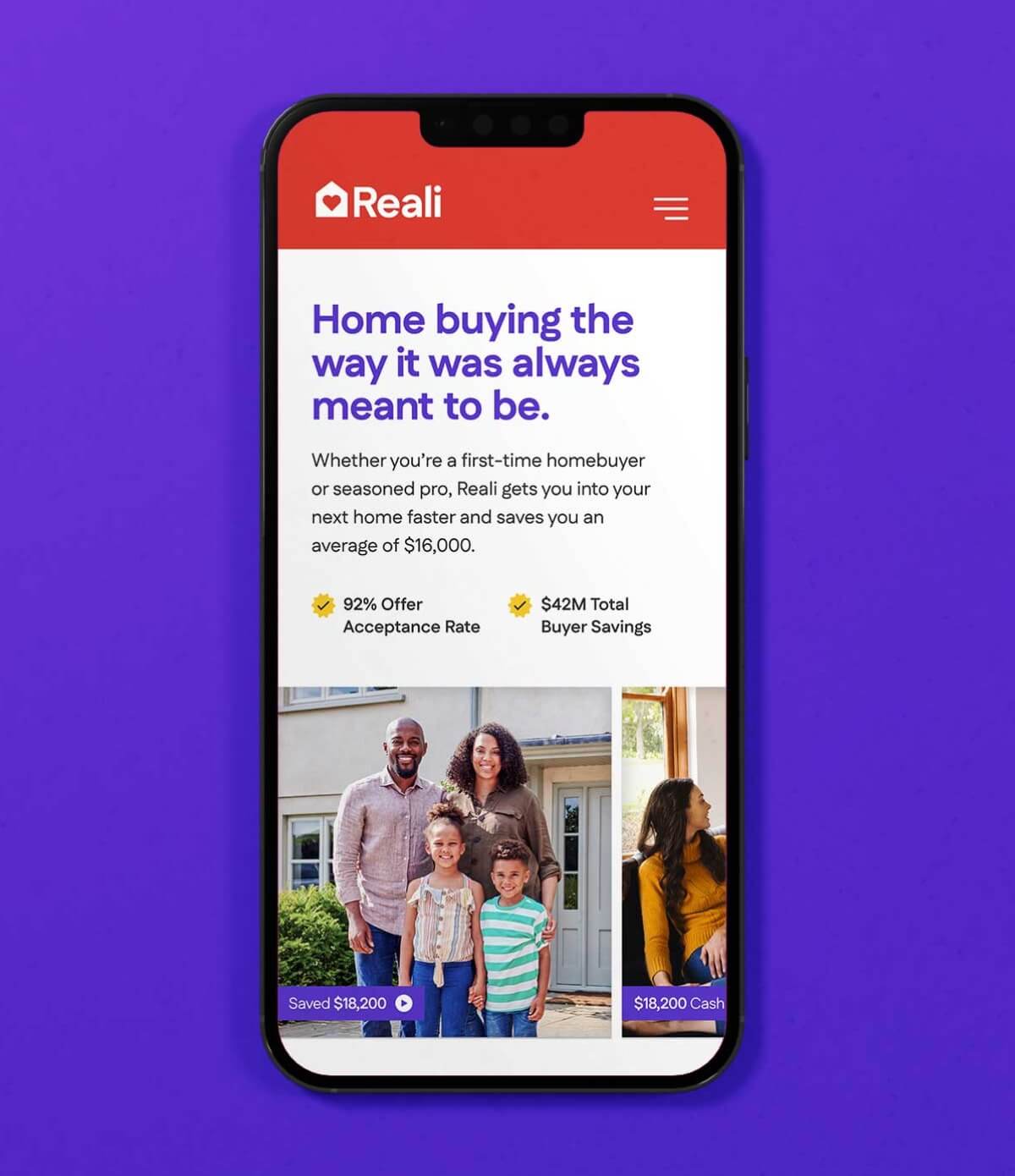
Reali simplified the chaos of real estate by bringing buying, lending, and support into one digital experience. Our job was to help them sound as smart and empathetic as their product. We refined the brand identity, built a new messaging framework, and restructured the UX to reflect what homebuyers really wanted: transparency, clarity, and confidence.
Metrics
263
Customer Survey
Responses
Responses
15
In-Depth User
Interviews
Interviews
12
Competitive
Product Audits
Product Audits
The Challenge
Too Big for The Brand
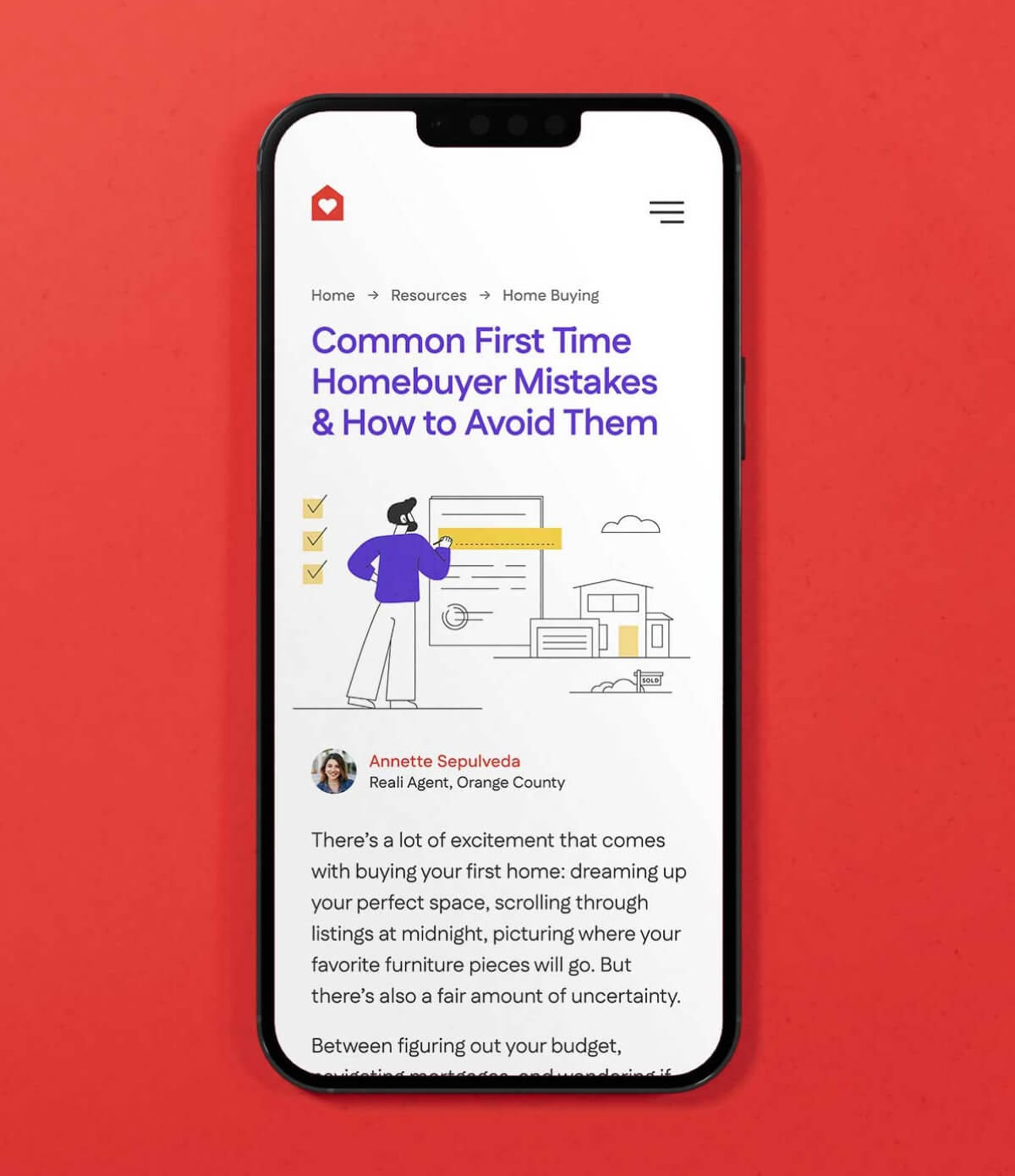
Buying a home should feel like a milestone, but usually it’s a minefield: confusing listings, endless paperwork, hidden fees, and stiff competition. Reali simplified things by bundling everything into one clear, intuitive platform.
The service was solving problems, but the brand wasn’t keeping pace. The design got your attention, but didn’t hold it for very long. The tone, while friendly, felt forgettable. And the website buried the company’s biggest advantage: a truly integrated real estate experience.
From support tickets to customer interviews, the feedback was consistent: people wanted honesty, not hype. Buyers wanted fewer surprises. Sellers wanted predictable timelines. Everyone wanted to feel less alone in the process. Reali needed a brand approach that felt both credible and laser focused on solving the stresses on modern buyers and sellers.
One of five core segments, the first-time buyer group steered our early decisions on content, layout, and service cues. Similar maps for investors, upsizers, downsizers, and cash-strapped sellers rounded out the playbook.
The Big Idea
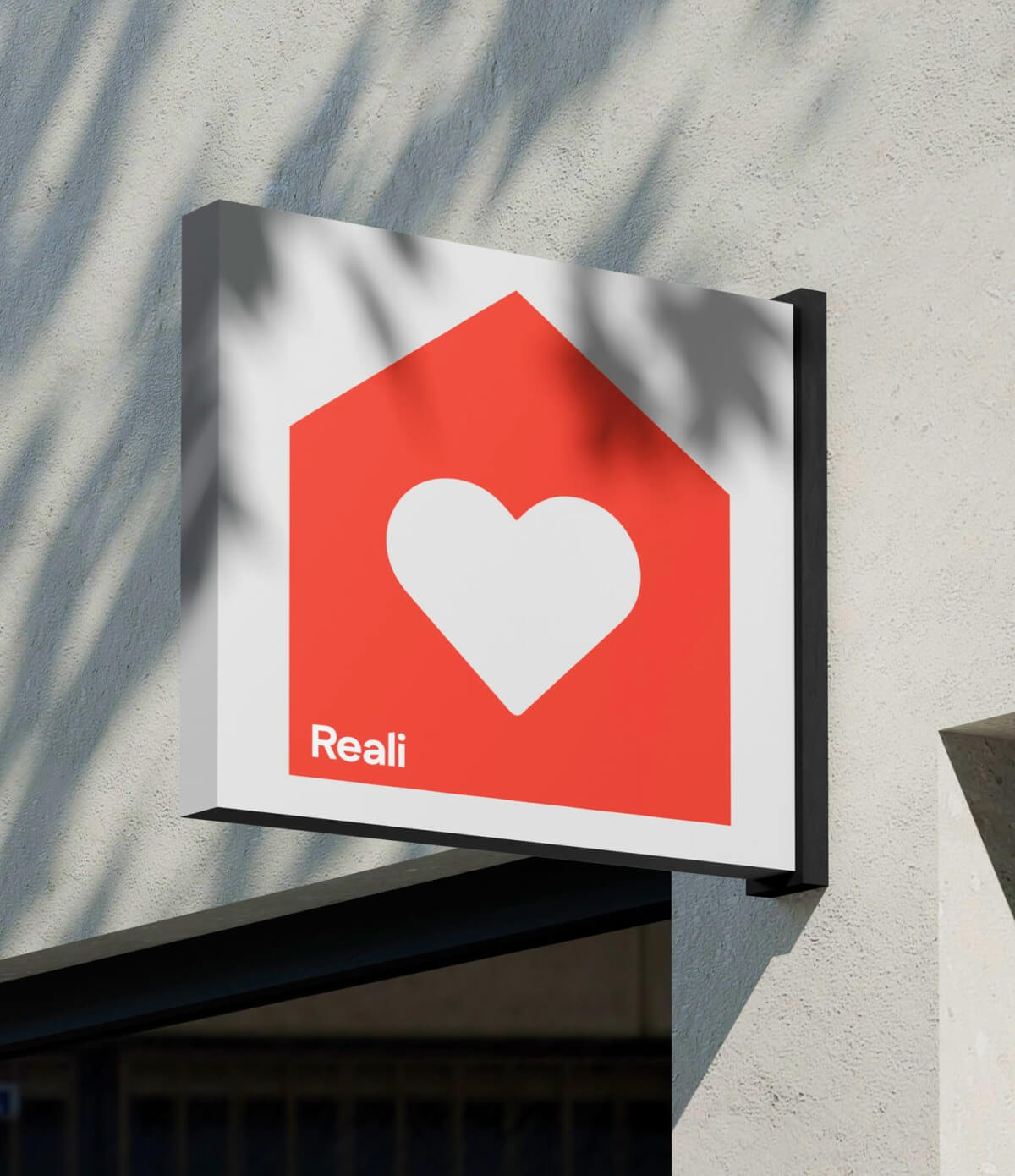
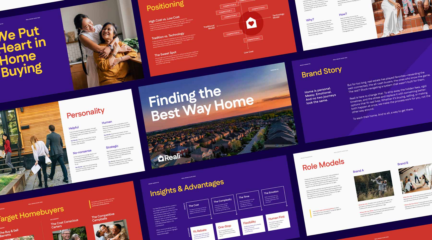
Put The Heart Back in Home Buying
Buying a home is stressful, and pretending otherwise only makes it worse. So we named it, normalized it, and made the brand part of the solution. Reali meets buyers where they are, then helps them move forward with confidence.
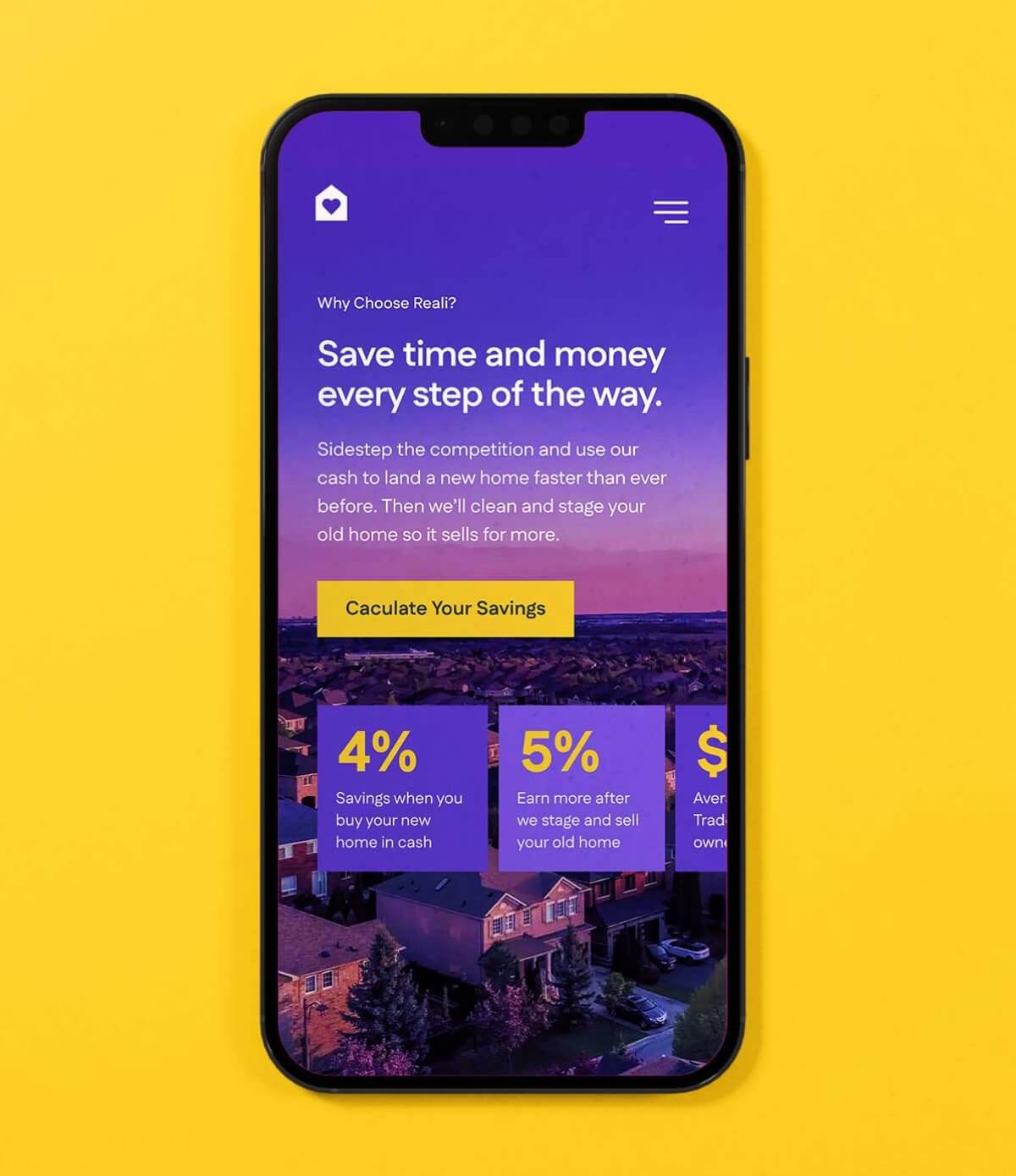
We redefined Reali’s voice to be the clear-eyed friend who knows the ropes. Not pushy, Just helpful, friendly, and always one step ahead. The visuals and copy invite users to exhale. Every headline has a job: to explain, simplify, or reassure.
Our goal was not to sell a lifestyle but to show the process in a way that felt achievable. That transparency became Reali’s emotional differentiator. The brand would succeed not by promising perfection, but by helping people move through the imperfect parts of buying and selling with confidence.
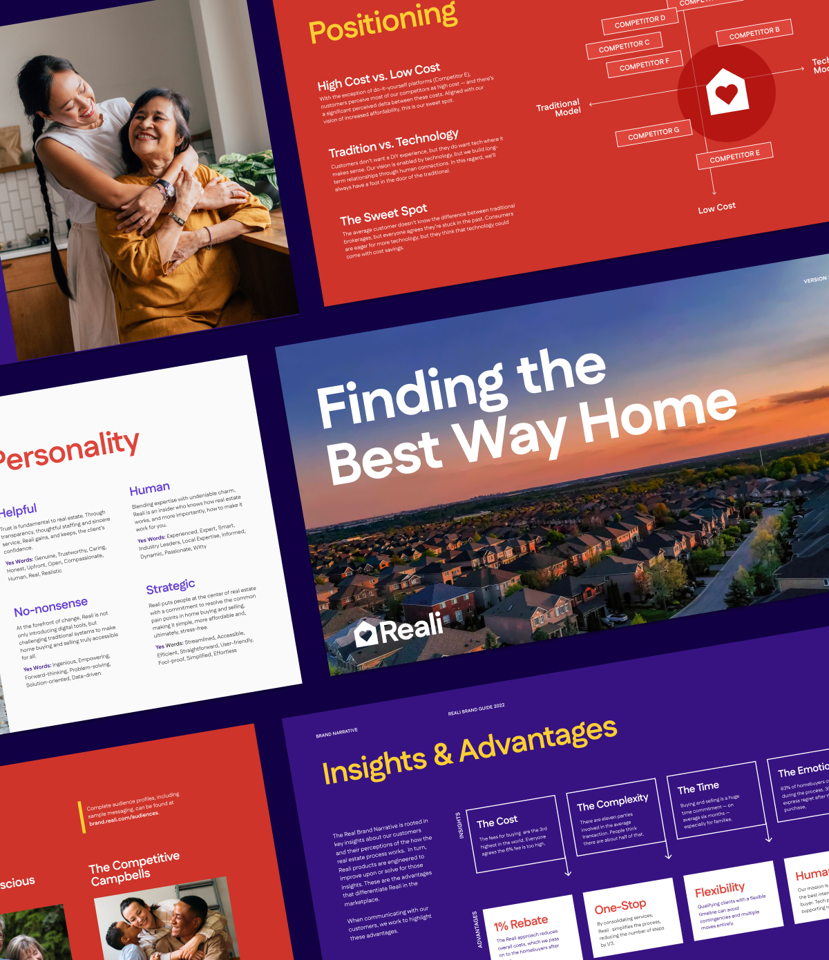
While competitors sold luxury and aspiration, we focused on what most people actually face: tough decisions, tight timelines, and the need for clarity. The new Reali brand replaced pressure with possibility.

The Approach
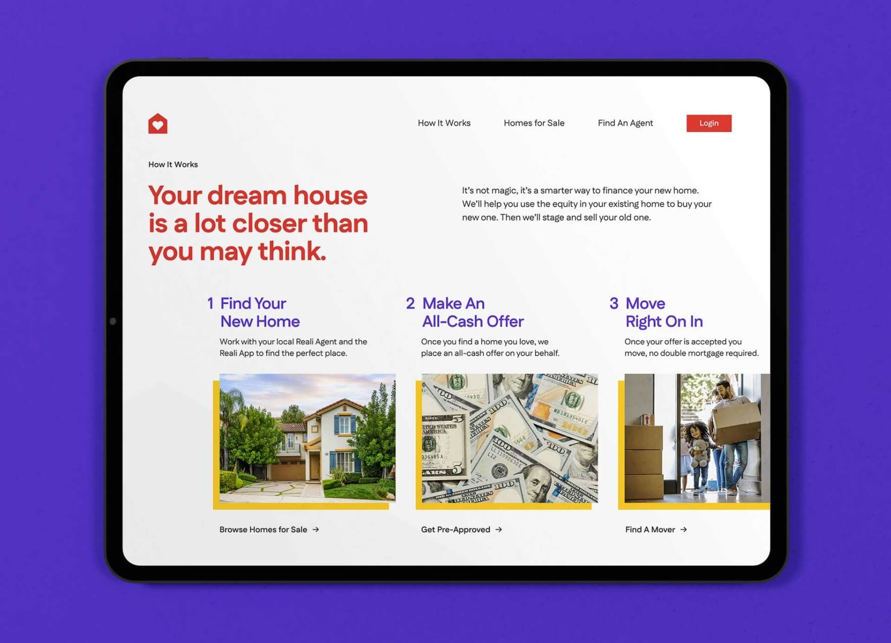
Speak Homeowner
Reali’s competitors sold aspiration. We sold understanding. The result was a brand that feels smart, approachable, and grounded—more proptech partner than a “business blue” cliché.
What changed:
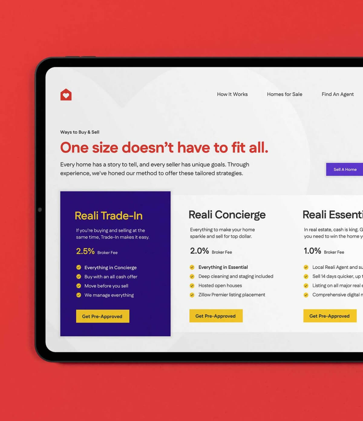
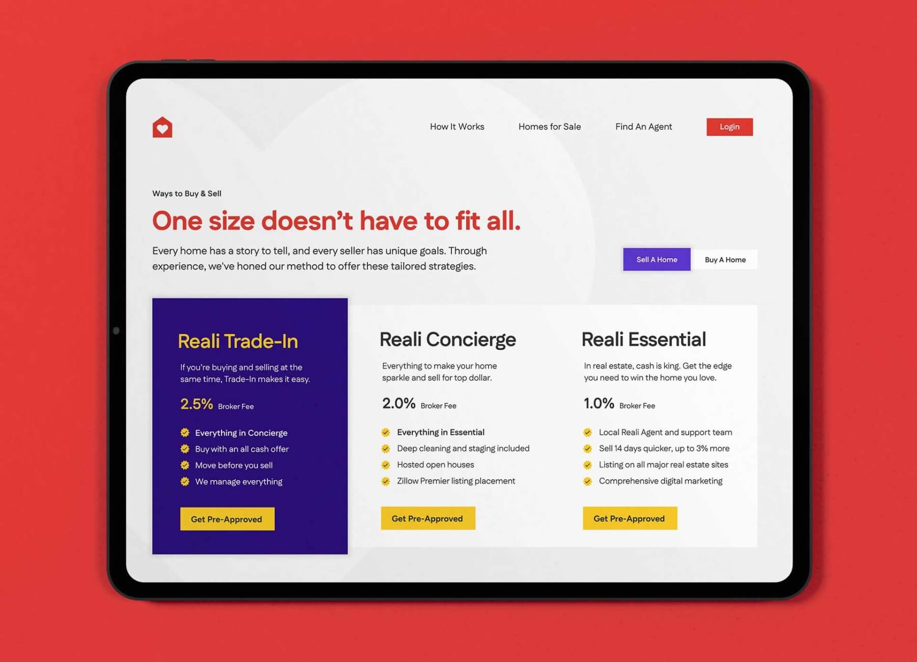
- Color system: Expanded the palette to reflect confident optimism instead of corporate safety.
- Typography: Structured and predictable to signal trust and consistency.
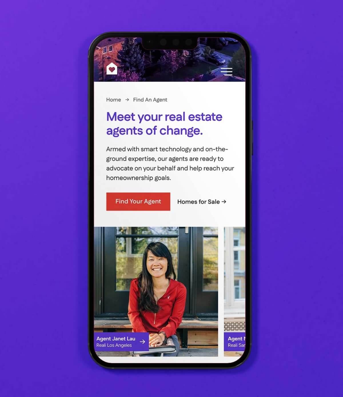
- Imagery: Replaced stock perfection with real homes and real people—messy, warm, lived-in.
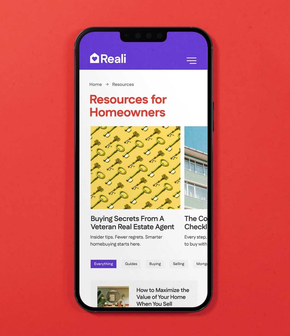
- Interface: Simplified everything. Smarter spacing, stronger grid, and cleaner modules gave the site clarity and calm.
Information architecture overhaul:
- Built out dedicated SEO-rich pages for trade-ins, refinancing, and loans.
- Structured navigation so each page earned its spot by simplifying a step in the journey.
- Balanced search performance with human readability to make content genuinely useful.
Unified voice system:
- From product headlines to help desk replies, every message came from the same “team.”
- The tone stayed consistent: human, clear, and ready to help.
- The result: no fine print, no marketing speak, just straight talk that built trust.
Transparency wasn’t just an abstract theme, it was a brand pillar and core design principal, from product to sales. Reali clarified choices, removed filler, and provided detailed explanations at each step so users could make decisions confidently.
We designed the kind of brand you notice for its honesty, not its gloss. We stripped back unnecessary layers, clarified choices, and wrote messages that explain, not obscure. The idea: no more “fine print” moments.


Results
The new brand and website were weeks from launch when Reali was acquired and folded into Flyhomes. The redesign never went public, but internally, the system became a north star. The visual identity, UX patterns, and messaging framework unified marketing and product under one story. The tone guide was used to train new teams and shape post-acquisition.
Most importantly, the team finally had a brand that reflected their product experience: transparent, intuitive, and designed for real people navigating real home ownership decisions.