Scope
Narrative Strategy, Microsite Design, Fundraising Prospectus
Role
Arts & Culture, Theater, Nonprofit
Year
2015
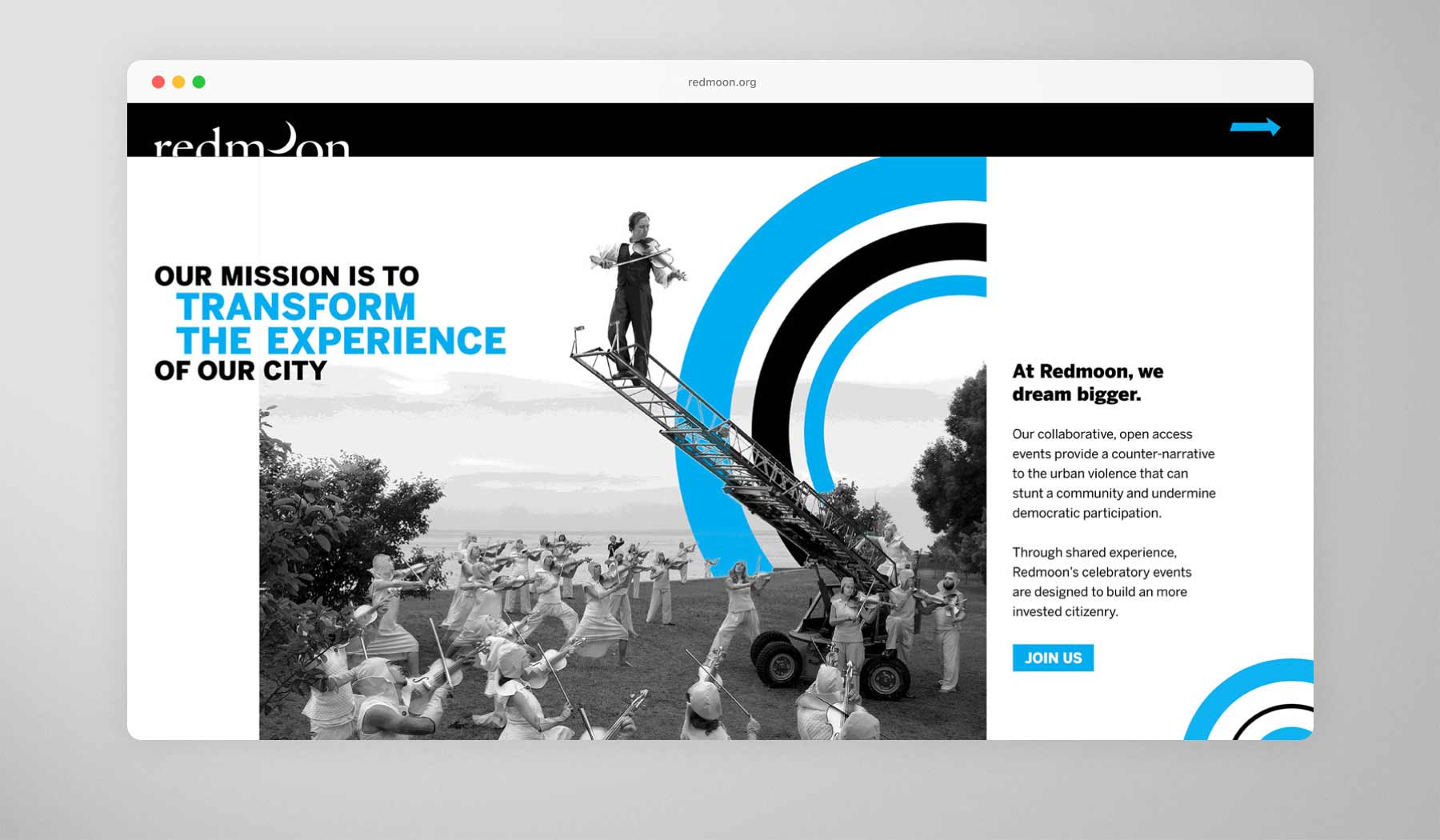
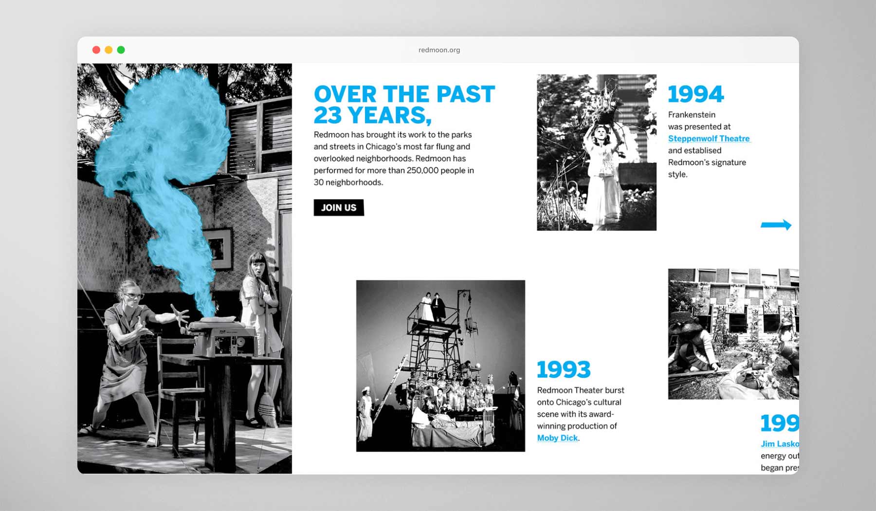
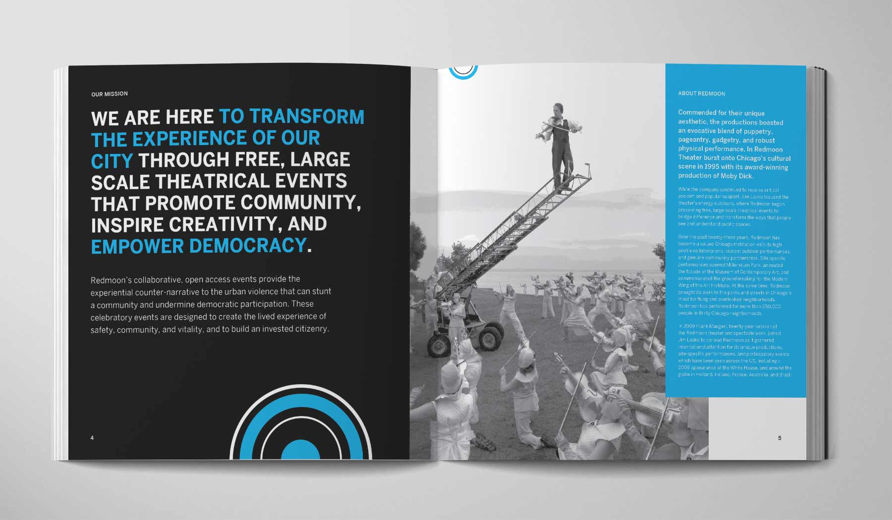
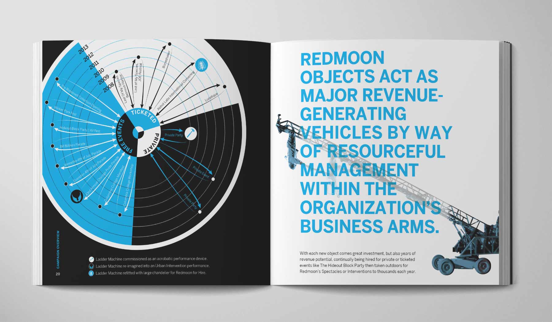
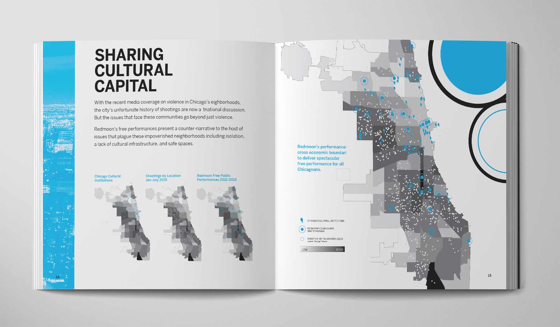
Redmoon didn’t do plays; they built public spectacles. Acrobats swung from buildings, cranes became musical instruments, and the Chicago River turned into a stage.
As their boundary-pushing vision grew, so did their ambition. With a new space and a citywide fundraising campaign on deck, they needed a way to turn their street-opera-meets-civic-movement story into something donors could see, feel, and rally behind. Our job was to make the magic feel measurable.
The Challenge
Big Vision, Small Budget
Redmoon had the ambition. They had the legacy. What they lacked was the kind of polished, structured material that could turn admiration into action. Their performances were explosive and emotive. But their fundraising materials didn’t reflect that same clarity or craft.
The challenge was twofold: stay true to the expressive spirit of Redmoon’s work, while delivering a format and message that philanthropists could trust. We had to create something that felt both artful and actionable.
Reimagining a theater brand known for fire and flight — with strategy that stayed grounded.
The Idea
Bring the Fire, Keep It Focused
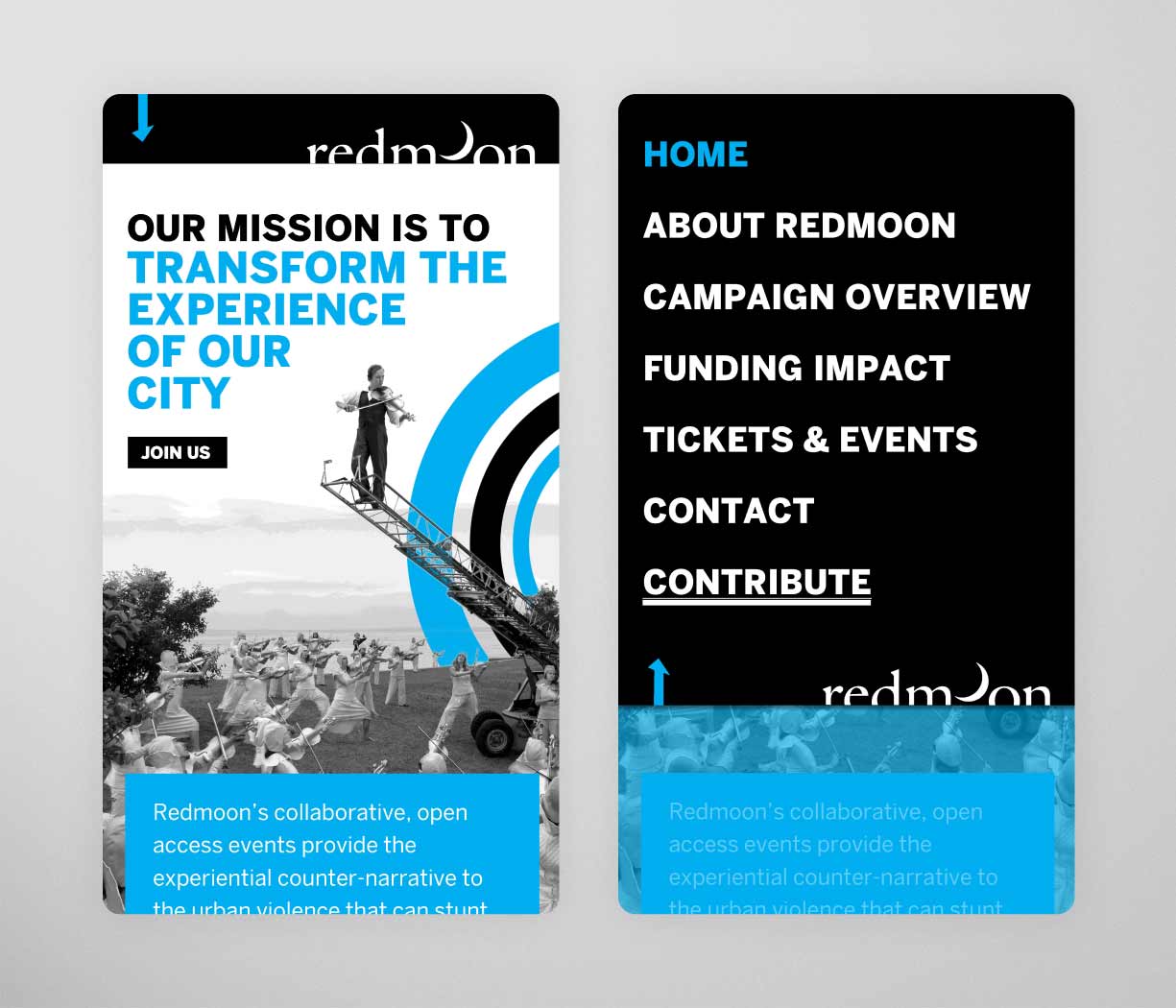
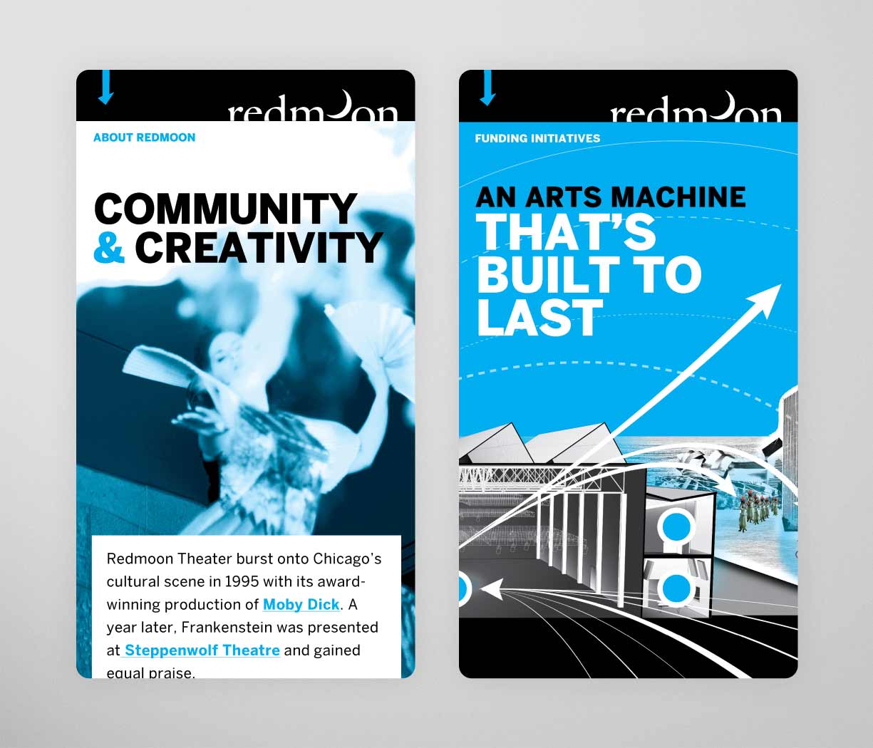
We wanted an approach as grand as Redmoon's vision but on the limited budget of a non-profit. So to keep print costs low, we limited the color palette but amplified the contrast. On the microsite, we drastically limited integrations and interactivity. Instead, we focused on ensuring the copy content (that is, the nuts and bolts of the plan) was easy to digest.
While the limited colors were initially a major concern (fire? in black and white?), they ended up working in our favor, defining the character of the work. The result is a vibrant, graphic approach to telling the Redmoon story and communicating their guiding principles.

The Approach
Immersive, Practical, Memorable
Redmoon entered their fundraising campaign with the tools to back up their ambition. The printed prospectus served as a leave-behind with impact. The microsite extended reach and reinforced credibility with partners and donors.
More importantly, the materials created alignment inside and out. They offered a shared language that helped Redmoon talk about their future with confidence and character.
Every page leads with proof. The homepage features live uptime and session data, followed by user journeys grounded in real scenarios—drivers, property managers, city teams. High-contrast imagery keeps things human and real, showing the product in action without over-staging it.
Takeaways
Making Art More Fundable
Redmoon showed that creativity can power both community and credibility. By bringing structure to their spectacle, we helped transform a Chicago cultural icon into a sustainable nonprofit brand built on story, not just scale.
Turning creativity into credibility
Expression and organization can coexist. By pairing emotion with clear messaging, Redmoon’s materials spoke to both the heart and the head—helping donors see that passion backed by process is worth investing in.
Expression and organization can coexist. By pairing emotion with clear messaging, Redmoon’s materials spoke to both the heart and the head—helping donors see that passion backed by process is worth investing in.
Building clarity into nonprofit storytelling
A clear story converts admiration into action. Through a unified voice across print and digital, we turned Redmoon’s artistic energy into a compelling narrative that donors, partners, and team members could all champion.
A clear story converts admiration into action. Through a unified voice across print and digital, we turned Redmoon’s artistic energy into a compelling narrative that donors, partners, and team members could all champion.
Designing for trust and longevity
Thoughtful design builds confidence. The campaign’s stripped-down aesthetic felt modern, bold, and disciplined—proving that restraint and clarity can communicate ambition better than spectacle alone. The result was a framework that continued to guide Redmoon’s storytelling long after the campaign closed.
Thoughtful design builds confidence. The campaign’s stripped-down aesthetic felt modern, bold, and disciplined—proving that restraint and clarity can communicate ambition better than spectacle alone. The result was a framework that continued to guide Redmoon’s storytelling long after the campaign closed.