Scope
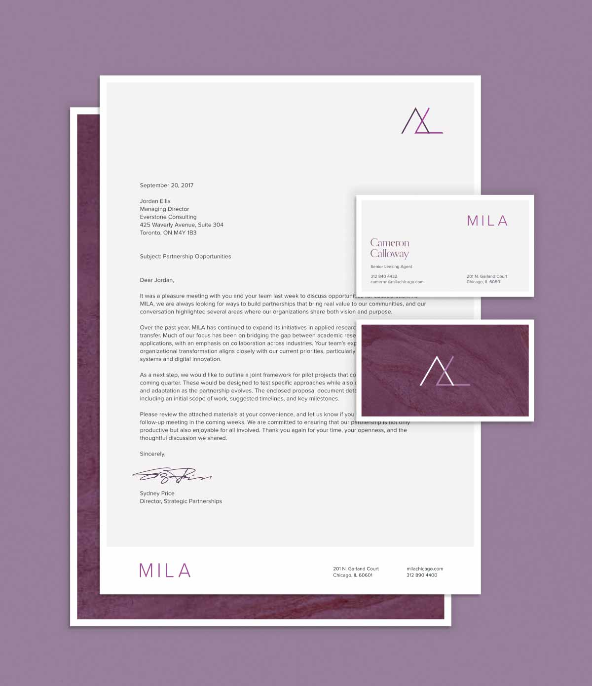
Brand Naming, Visual Identity, Website Design, Narrative Development, Property Marketing
Industries
Real Estate, Luxury Rentals, Hospitality, Multifamily
Year
2016
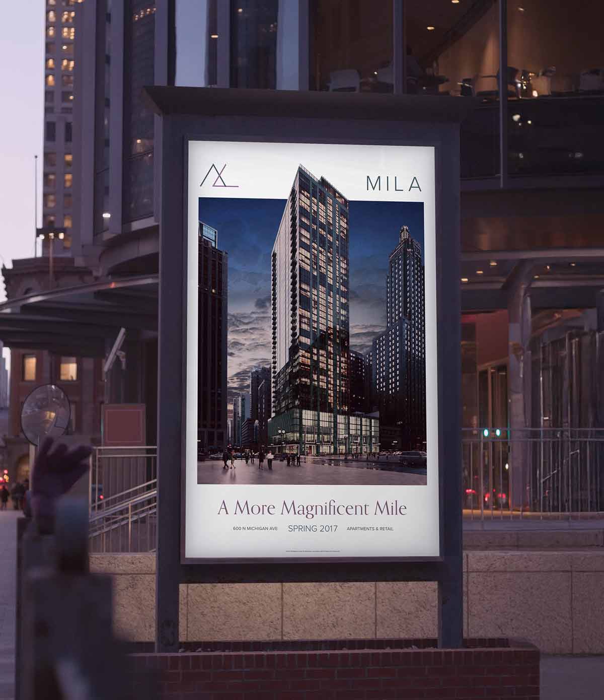
Mila was a moment for downtown Chicago: the first new residential tower on the Magnificent Mile in more than thirty years. The address came with legacy, pressure, and plenty of eyes watching.
Our job was to give it a brand that matched its confidence: sleek, modern, and unapologetically urban. The result blended architectural sophistication with street-level energy, from name to narrative to design, creating a presence as bold and magnetic as its skyline view.
Metrics
98%
Lease-up,
First 6 Mos.
First 6 Mos.
45K
Unique Visits,
First 3 Mos.
First 3 Mos.
3:1
Return, Brand
Marketing Spend
Marketing Spend
The Problem
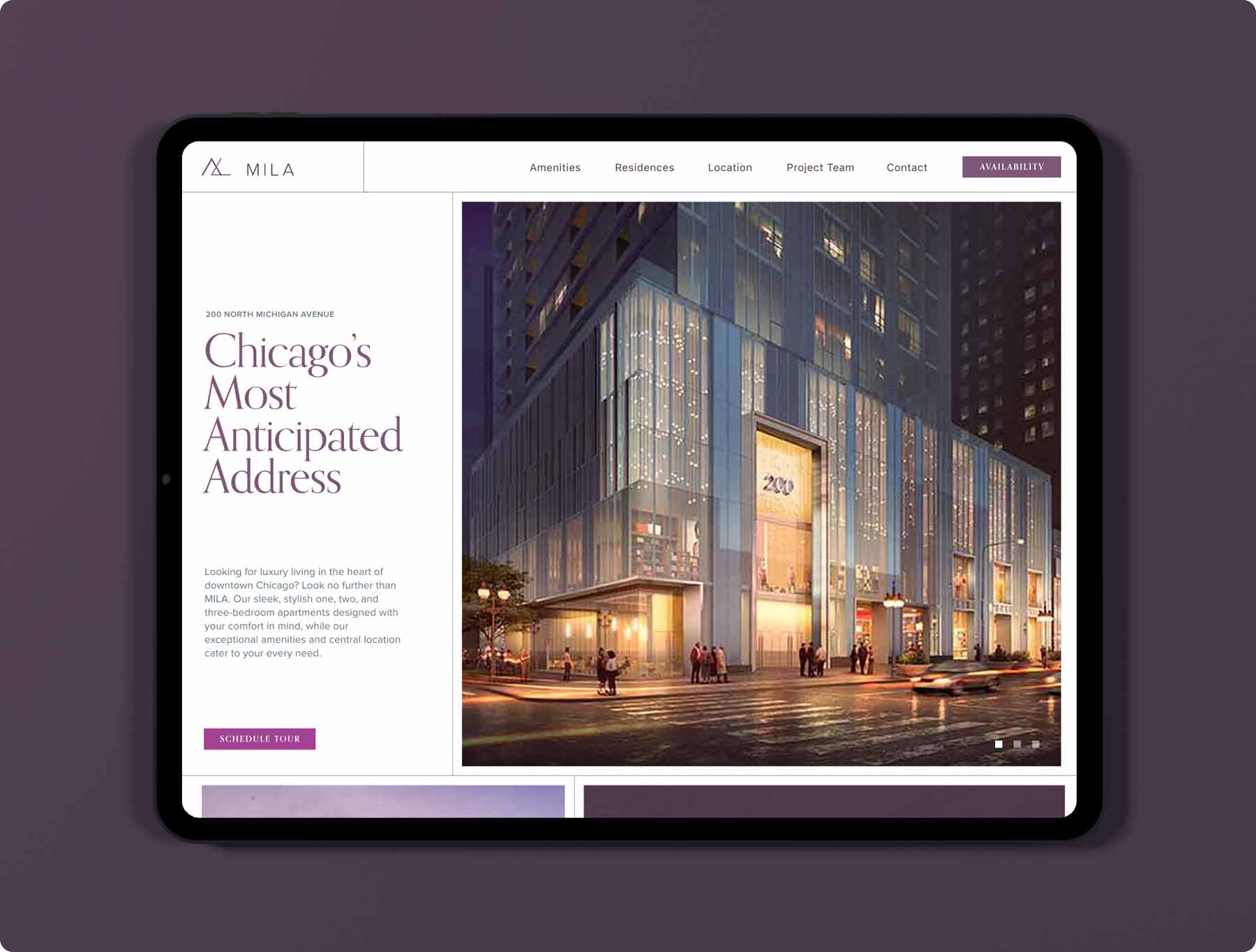
New Tower. No Story.
The site was prime, but the concept was still taking shape. Mila would bring high-end rental living to a part of Chicago better known for flagship retail and luxury hotels. It needed to attract a younger, design-conscious audience (students, young professionals) without ignoring the prestige that comes with a Magnificent Mile address.
The brand had to do more than list amenities. It needed to reintroduce a location most Chicagoans thought they already knew and make space for a different kind of downtown living.
The Mila brand introduced a softer, design-driven perspective to Chicago’s high-rise market. The brand’s name and tone combined modern architecture with an approachable human energy.
The Approach
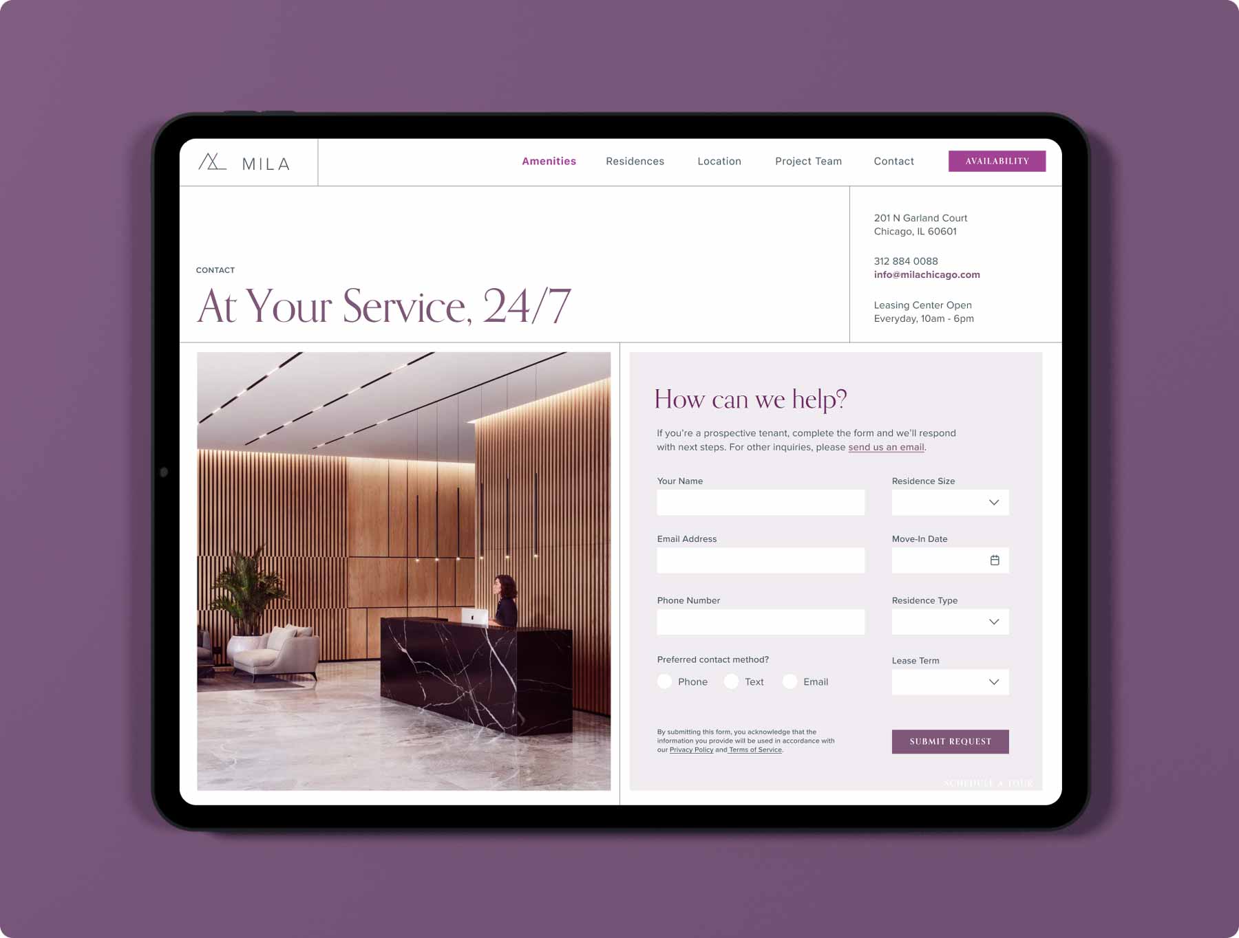
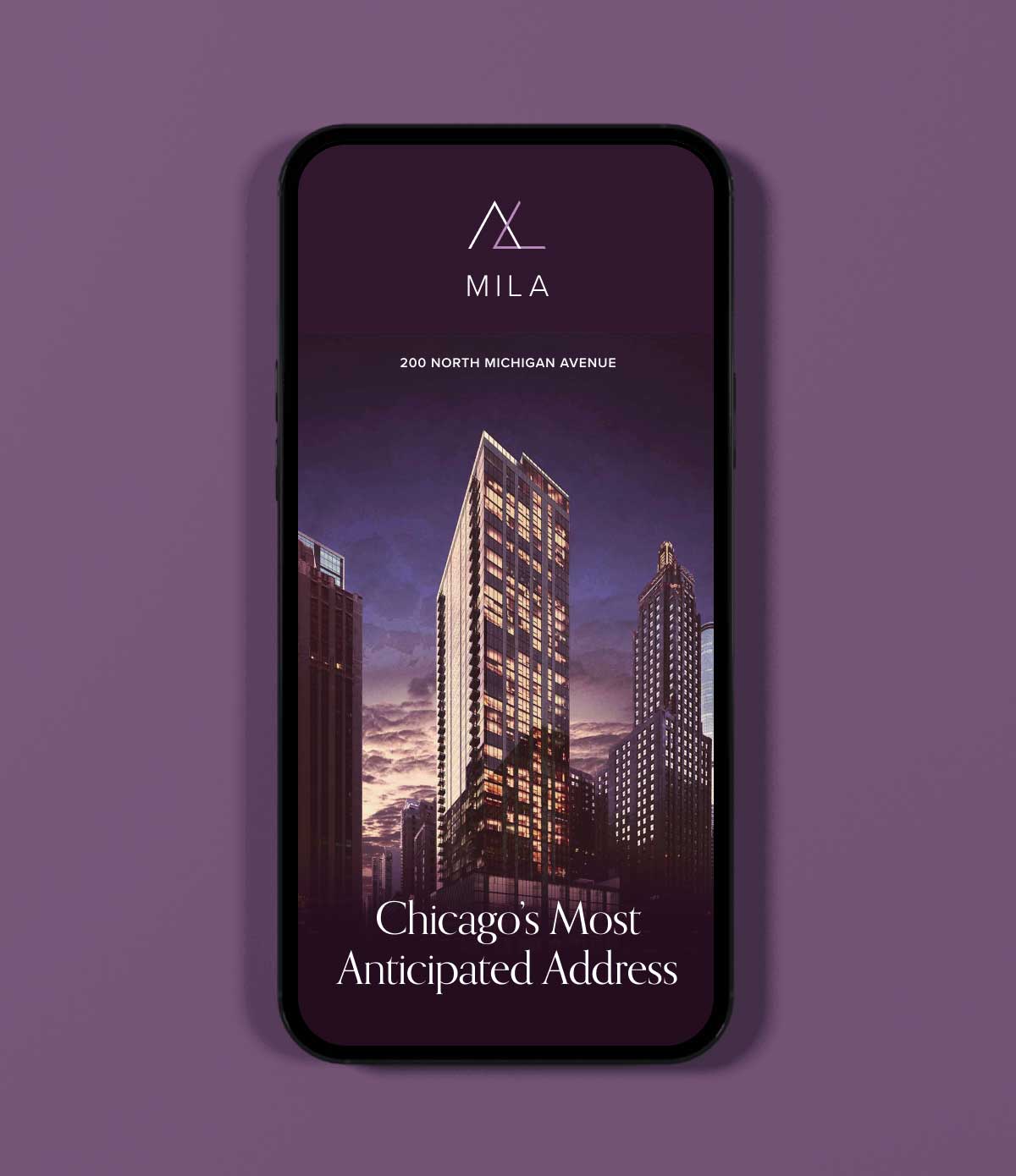
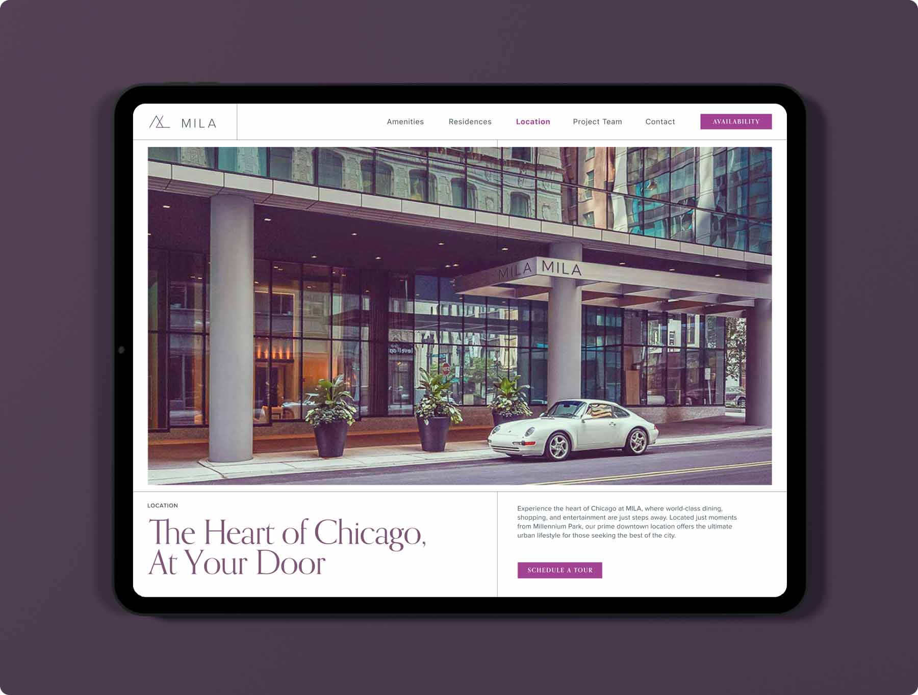
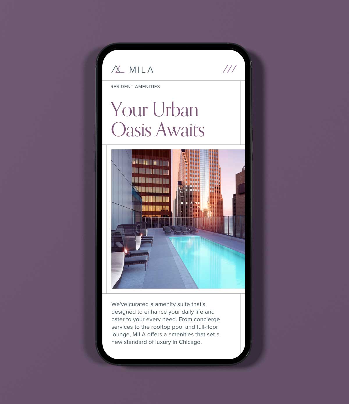
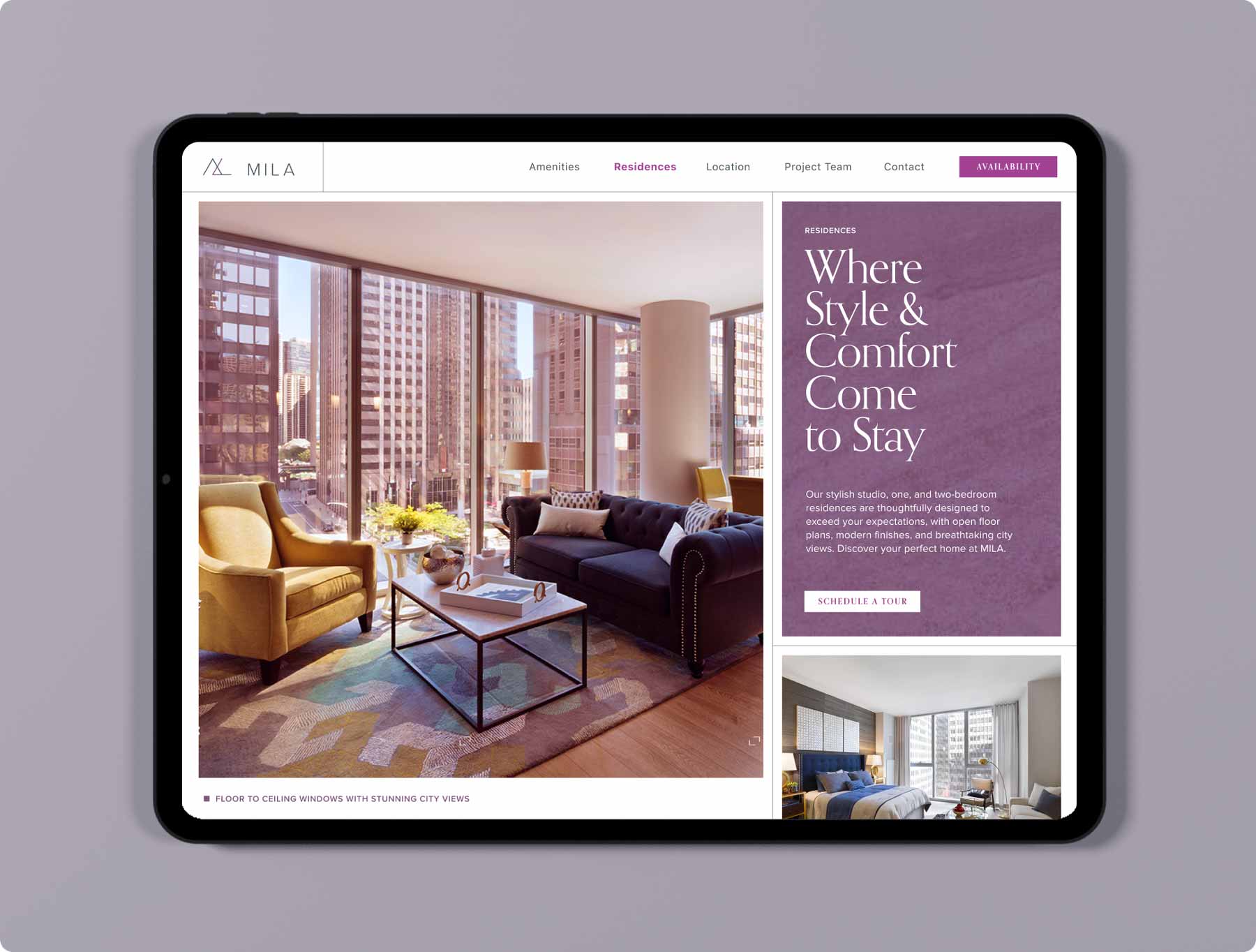
Design That Reflects the City
The identity pulled from both the skyline and the lakefront. We used clean typography, an elevated neutral palette, and structured layouts that nodded to the building’s architectural lines. On the website, wide margins and confident spacing mirrored the openness of the floorplans and the building’s glass-heavy facade.
Content focused on lifestyle: Instead of just listing features, we told the story of what it feels like to live at Mila—from morning walks to lake breezes to being steps away from art, food, and the loop. Photography played a central role, placing viewers in the scene rather than selling from the outside in.
Results
98%
Lease-up, First 6 Mos.
45K
Unique Visits,
First 3 Mos.
First 3 Mos.
3:1
Return, Brand
Marketing Spend
Marketing Spend
Mila opened with a distinct identity in a market crowded by sameness. The name sparked conversation. The visuals drew attention. And the voice invited a younger, more design-literate audience to see the Mag Mile in a new light.
Today, Mila stands as more than a luxury rental, it’s a reminder that even the most iconic streets still have room to grow, evolve, and welcome what’s next.
Takeaways
Branding a New Icon
Mila proved that luxury branding doesn’t have to feel distant. When a name, design, and story align with how people actually live, a property can transcend its address and become part of the city’s rhythm.
Naming a property that captures both location and lifestyle.
A strong name is both anchor and aspiration. “Mila,” drawn from Michigan and Lake, grounded the brand in its exact location while adding warmth and modernity. It signaled sophistication without pretension; a name that felt as livable as it was memorable.
A strong name is both anchor and aspiration. “Mila,” drawn from Michigan and Lake, grounded the brand in its exact location while adding warmth and modernity. It signaled sophistication without pretension; a name that felt as livable as it was memorable.
Designing real estate brands that reflect architecture.
The visual identity mirrored the building’s design: clean lines, open space, and a natural rhythm of structure and light. Typography, layout, and photography carried the architectural story forward, turning brand materials into an extension of the skyline .
The visual identity mirrored the building’s design: clean lines, open space, and a natural rhythm of structure and light. Typography, layout, and photography carried the architectural story forward, turning brand materials into an extension of the skyline .
Launching property campaigns that connect emotion to place.
The campaign sold a feeling, not a floor plan. By leading with lifestyle — morning light, city movement, and connection — the brand reached audiences looking for belonging, not just amenities. The result: a fully leased tower and a blueprint for how design-led storytelling drives measurable results.
The campaign sold a feeling, not a floor plan. By leading with lifestyle — morning light, city movement, and connection — the brand reached audiences looking for belonging, not just amenities. The result: a fully leased tower and a blueprint for how design-led storytelling drives measurable results.